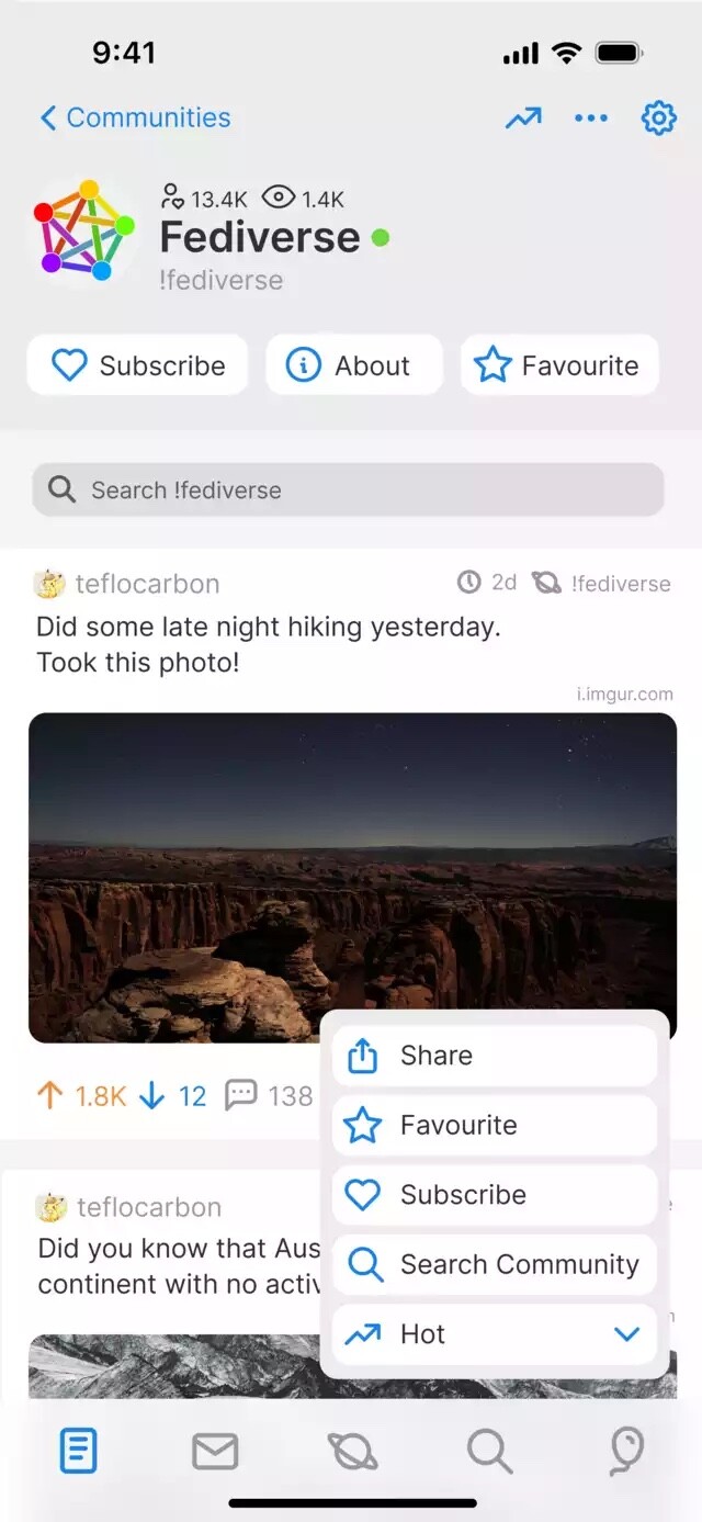
wakest ⁂@social.wake.st to Memmy - An iOS client for Lemmy@lemmy.ml · 3 years agoMemmy redesign is requesting feedbackcdn.masto.hostimagemessage-square2linkfedilinkarrow-up15arrow-down10file-text
arrow-up15arrow-down1imageMemmy redesign is requesting feedbackcdn.masto.hostwakest ⁂@social.wake.st to Memmy - An iOS client for Lemmy@lemmy.ml · 3 years agomessage-square2linkfedilinkfile-text
minus-squarecrocodileneptunelinkfedilinkEnglisharrow-up1·3 years agoLooks good. Still I think the bottom bar should have text not just icons to avoid confusion
minus-squarewakest ⁂@social.wake.stOPlinkfedilinkarrow-up1·3 years ago@crocodileneptune you wouldnt be able to fit that many icons down there if you had text too especially when translating them into many languages, but maybe a long press on the icon could result it a tool tip like label showing


Looks good. Still I think the bottom bar should have text not just icons to avoid confusion
@crocodileneptune you wouldnt be able to fit that many icons down there if you had text too especially when translating them into many languages, but maybe a long press on the icon could result it a tool tip like label showing