I like the way the metals pop in the newer version, and the materials of the equipment moved from shiny plastic to some kind of actual fabric based gear. I tend to go pretty vibrant when I can manage it editing my personal pictures, so I understand the appeal of a punchy look, but it takes pretty careful calibration to keep it from looking really fake in motion. Having a variety of materials is what allows the really flashy stuff to pop. If everything is shiny it loses its appeal fast.
I do find the more contrasty face more appealing, but behind a helmet I don’t think it’s realistic. The other faces that aren’t covered look like they have more depth, but the difference in their prime example is all about the helmet diffusing some light.

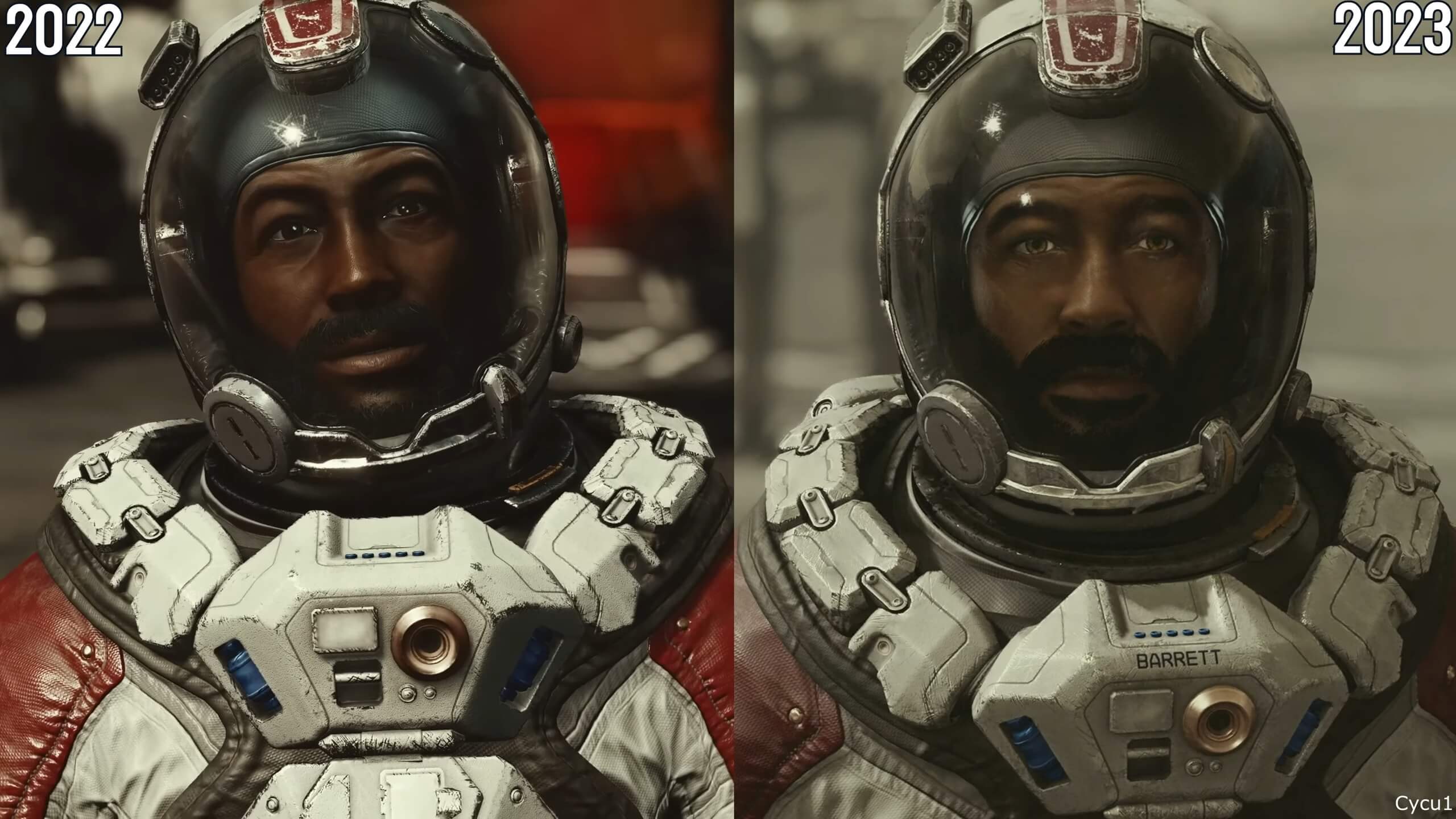
I definitely prefer the more saturated colors but the pictures are entirely out of context to a point where you can’t really judge
I like the way the metals pop in the newer version, and the materials of the equipment moved from shiny plastic to some kind of actual fabric based gear. I tend to go pretty vibrant when I can manage it editing my personal pictures, so I understand the appeal of a punchy look, but it takes pretty careful calibration to keep it from looking really fake in motion. Having a variety of materials is what allows the really flashy stuff to pop. If everything is shiny it loses its appeal fast.
I do find the more contrasty face more appealing, but behind a helmet I don’t think it’s realistic. The other faces that aren’t covered look like they have more depth, but the difference in their prime example is all about the helmet diffusing some light.