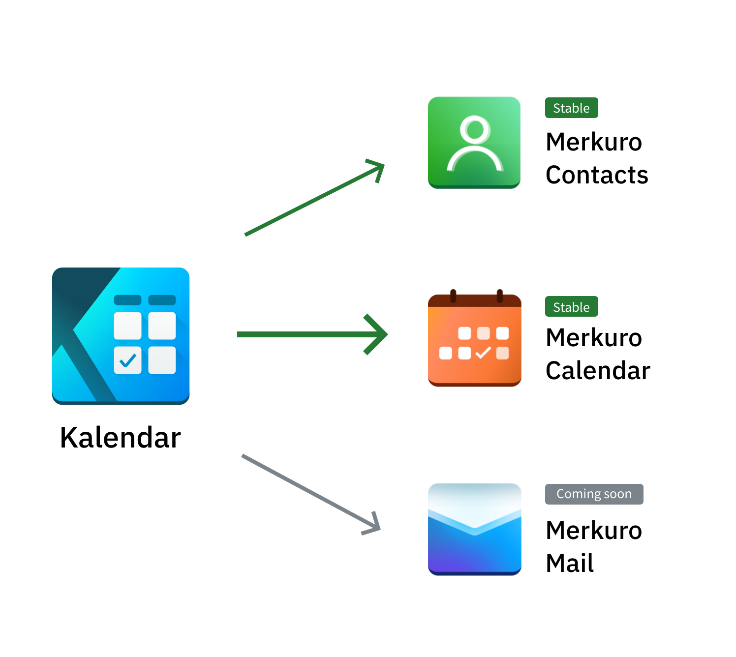
This email icon is a symmetrical blue/purple multicolor gradient with a shaded top. ProtonMail is an asymmetrical design in one color with varying levels of brightness and a blank top. The two look pretty distinct to me. Even without the different colors, the change in symmetry is quite obvious.
I do agree these don’t have unity in their design though as a set, they look pretty generic.