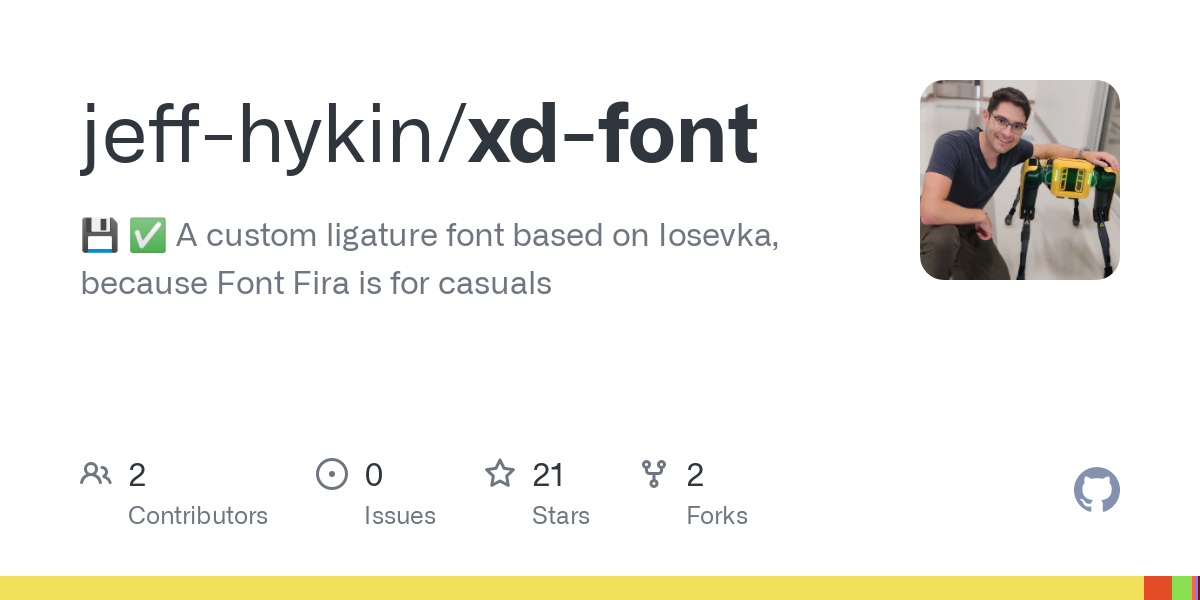
Its not much, as its a variation on Iosevka, exclusively for programming, and I made it a while ago, but I wanted to see what the community thinks. (I tried including a picture with the post but it failed to upload for some reason)
I’d love to see more open source self-made fonts. Any criticisims on functionality, or recommended changes are welcome.
Oh thats a good point, I didn’t include it.
alook like an “o with a tail” instead of a backwards 6 with a tail (if that makes sense, its kinda hard without a picture). I did changes like that for a handful of characters, I think it was a, l, {, }, and maybe y as well.Also I really really tried patching XD Font to include the Nerdfont (https://github.com/ryanoasis/nerd-fonts) icons. There are patching tools for it but ultimately I couldn’t get them to work.