- cross-posted to:
- linuxmasterrace@kbin.social
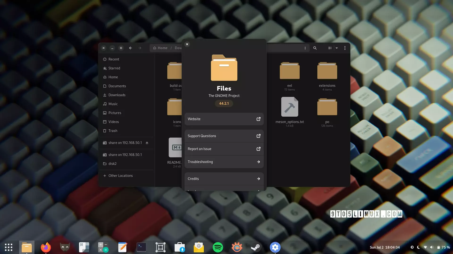
very nice to read Nautilus is getting some development done. I’m curious if it will be possible to simply type letters or combinations of letters and by doing that jump directly to the files that match the these letters. (like it works on windows - one of the things windows does well).
I also hope this weird issue when opening a very large folder with lots of images gets fixed (where while loading the images everything is moving around).
This one, “typing a letter and jump …”, would be great. In my opinion the UX design of the Windows File Explorer is really good, especially the stability, different views and sorting, grouping and renaming files and folders. There I only miss the collapsable list view from Mac Finder or Nemo.
It looks nice but its still missing a folder tree on the side panel. As a Mac user at my work the Multi column view is still strange for me – I think that’s because until today there is no similar browsing style on any other platform. But what bugs me most in GNOME file manager is this renaming dialog for single files – this should be inline like on every other file manager and accessible via one click on the file name. Renaming multiple files is okay, but I think I will stay with Nemo – so I keep hopes up for GNOME 46.
Honestly, I do not like renaming by clicking the file name. On windows I have accidentally renamed my files so many times when just trying to open them. I used to be very confused, because the feature is not explained anywhere and there is no visual indication of it.
Gnome tries to make the UI as easy to use (for non-technical people) as possible and that is probably why this feature is missing.
The Marlin GTK 3 file manager supported miller columns (the feature you are describing which is similar to the one in Finder). Hover it was abandoned. The Elementary project is maintaining a fork called Pantheon Files.
Awesome. I’ve used nautilus for almost 20 years now and it has only gotten better
Glad to see! I have to say, I would like to see a NeXT/macOS like multi column view where clicking on a folder opens a new column to the right. (That said, it’s not so important that I looked up alternate file managers.)


