I have been playing around with the Jerboa UI to make it a bit more usable for my style.
Since I would call some of these UI adjustments significant to the original design and I have used a couple different libraries I don’t think I should create a pull request for them but I might need to see.
- Changed the theme to an
amoled darkstyle. - Fixed the weird font scalings for comments.
The comment (markdown) text fields were set to scale to x1.3. I am sure this was probably to fix something somewhere but it made the comments way to big for me and restoring it caused no ill effects from what I can tell on my phone. - Fixed the
flash bangtransitions. Optimized for the dark theme. - Activity transitions changed for proof of concept but work pretty well so far for my style.
- Comment cards made significantly more compact.
- Comment toolbar (voting options) are now hidden as they take too much space for my liking. Clicking the comment shows/hides the toolbar.
- Collapsing comment chains now collapses smaller with a better indication of being collapsed.
I am sure there are other items I adjusted as well and there is always more to do, although I figured I would put this out there and see what the feedback is like.
Looks great!
Make sure you open up some PRs for these if you haven’t already.
Gonna be honest, you had me at amoled dark theme and I didn’t read the rest
I remember the dev said previously that the big comments were an unintended byproduct in order to accommodate images in replies properly. Maybe test that on your end to see if your fix is compatible with that functionality.
The rest looks great though!
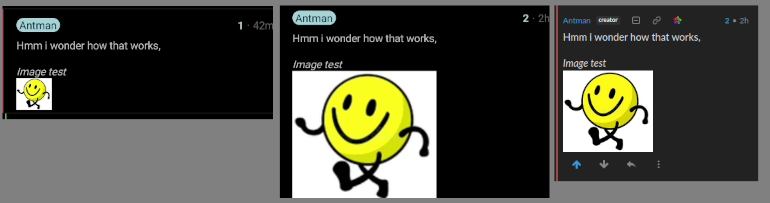
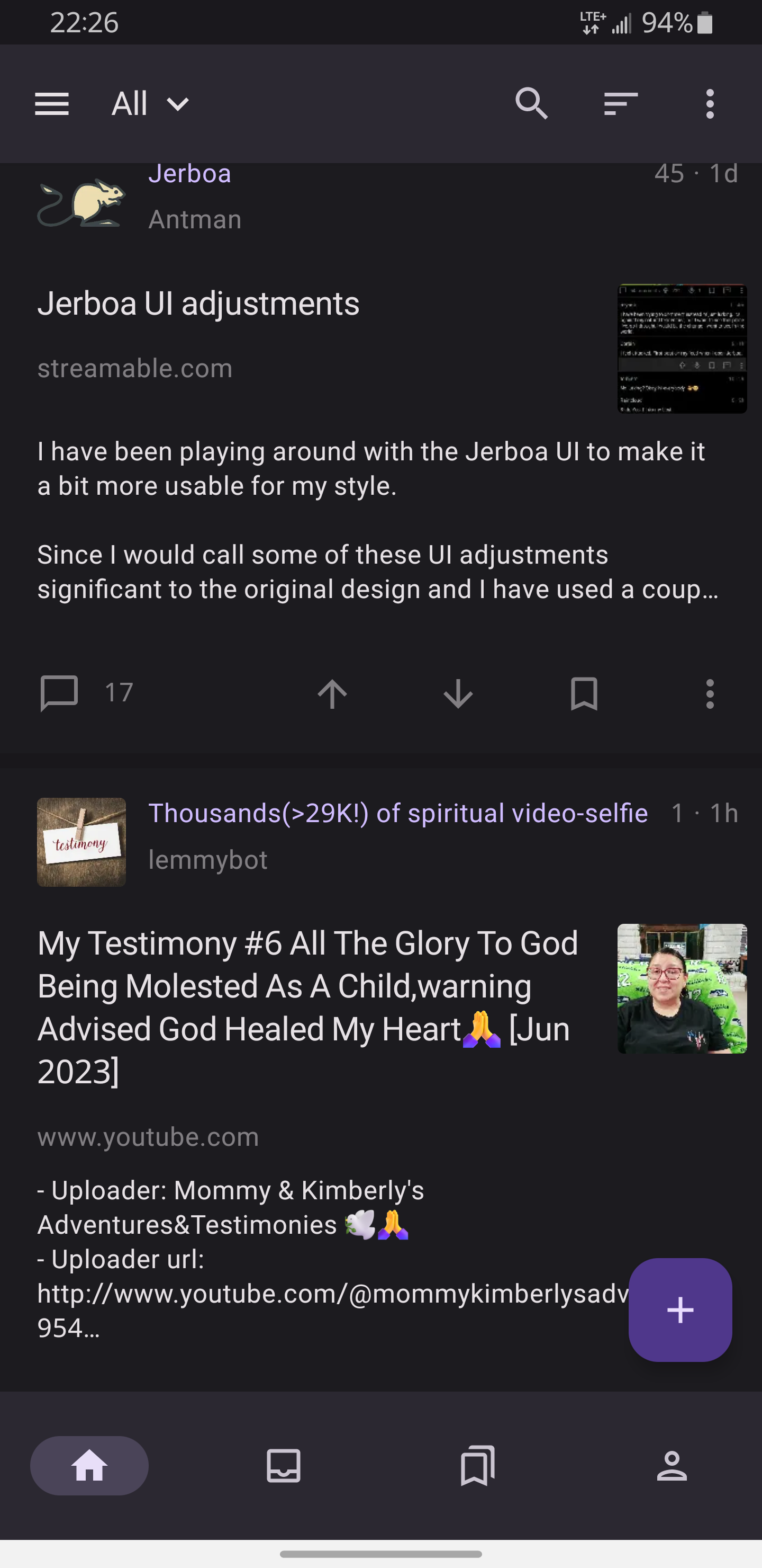
Hmm i wonder how that works,
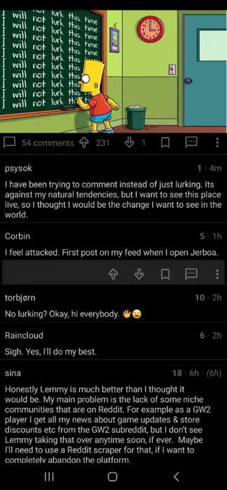
Image test

Ah i see. It’s significantly smaller (maybe 45% the size)
I am less worried about the image size then the really large comment text though, but I will see if there is a workaround I can help out with.
What a pain this has been
From left to right: Android image before, android image after (full scale), Render in the web.
I mean realistically there should probably be a thumbnail and then an expanded view on click.
Or better yet completely hidden and images disabled. Whats stopping someone adding horrific images as a commenter and forcing everyone in the thread to view it?Whats stopping someone adding horrific images as a commenter and forcing everyone in the thread to view it?
I agree with you for this exact reason. Lemmy has had its share of trolls in the the past who have abused this feature by posting scat porn in random threads. It makes browsing Lemmy in public scary.
Plus, it makes it easier for people to just spam emotes or GIFs that ultimately lessen the quality of discussions. I’ve seen many Reddit threads that are just:
gif
gif
gif
gif
Looks like larger images scales to the width of the comment block to the above image looks good on the app
Really hoping that one day I can slide the stories left or right and up/down vote like how Relay for Reddit currently works.
By chance could you do a pr to fix issue #175?
I can see these items in the code however how do you
readthem? (I know they are for visually impaired but never needed to use them before)These may also be put on the back burner as they most likely need to be multilingual.
Looks really good, even if it’s rejected, doesn’t hurt to try and PR
Also playing around with the UI
Oh hey it’s me, ma I’m in a Lemmy development video! Also fr that looks like a banger
This looks perfect for me. How can I use this? Is there a pull request?
Pull requests incoming
Is there a way to make it optional to switch between your comment click handling? I really like how the current app handles collapsing by clicking on the comment and i believe that there will be many users that prefer your option as well. I think this app will flourish with more options in the look and feel area.
@therealfooza this looks great is this released as a fork anywhere?
Given the feedback and fixes I am going to contribute back to the original project. If the UI changes are too drastic I will consider managing a separate fork.
@therealfooza ah great! that’s wonderful news
Please keep in mind that amolded dark modes can not be used by people with migraines and always need to be optional next to normal “dark” but not black themes.