- cross-posted to:
- france@lemmy.world
- bean@lemmy.world
- cross-posted to:
- france@lemmy.world
- bean@lemmy.world
Hey 👋 I’ve been working on a new Lemmy client called Bean for the last few weeks and I’ve put out an early beta.
It’s missing some features at the moment but I’m working to get it feature complete by early next week and would appreciate some feedback as I develop!
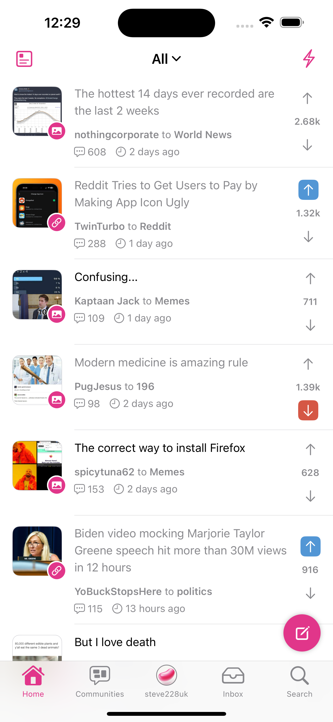
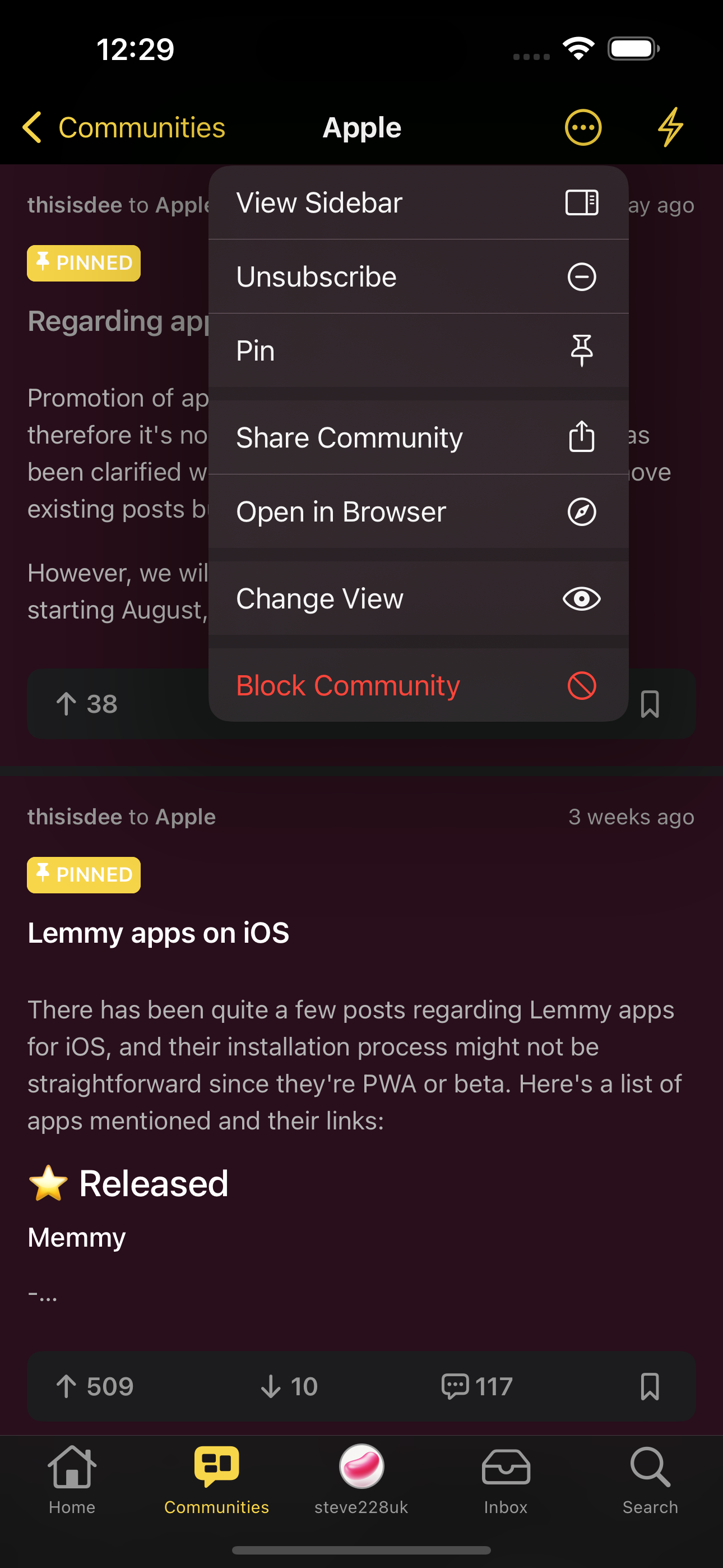
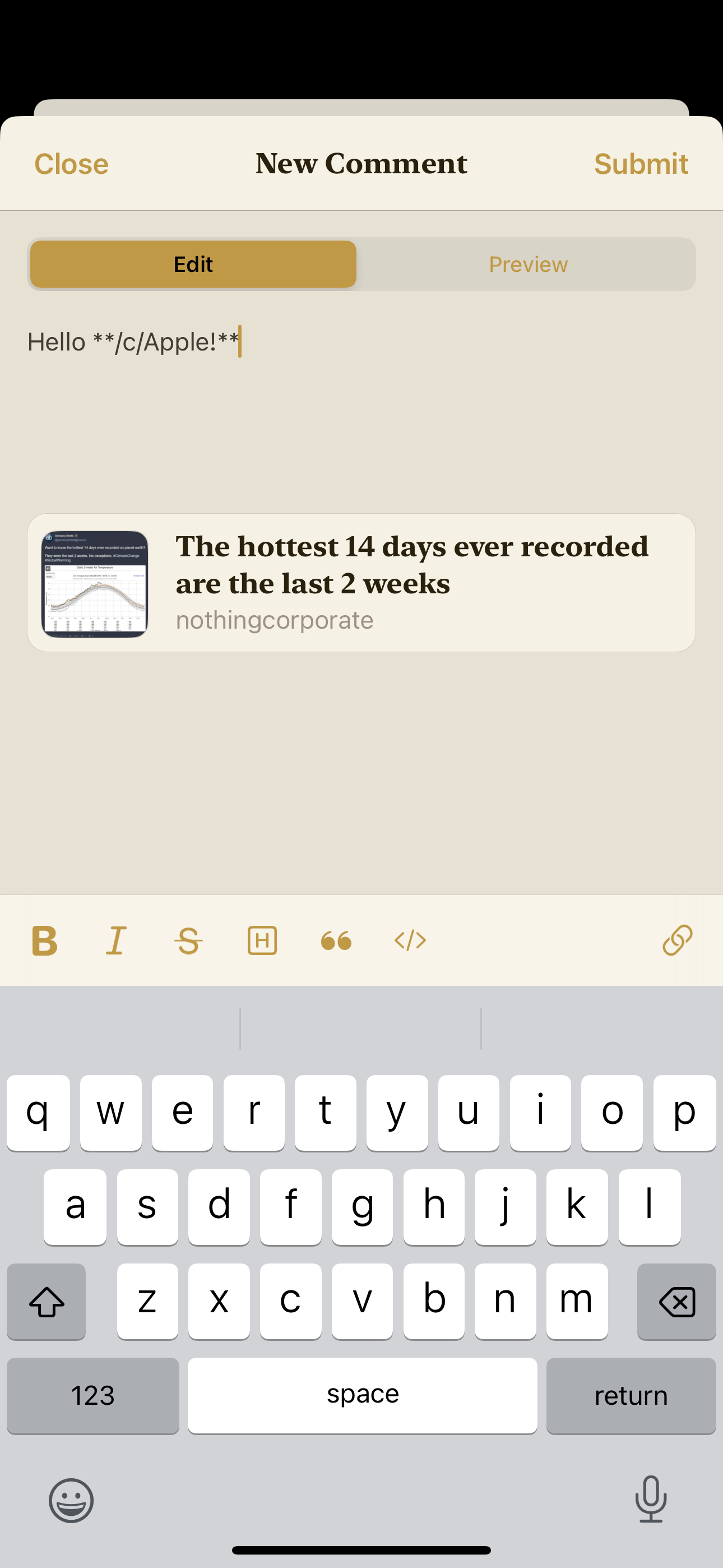
You can find out more over at !bean@lemmy.world but here are a few screenshots.
Let me know what you think if you do check it out.


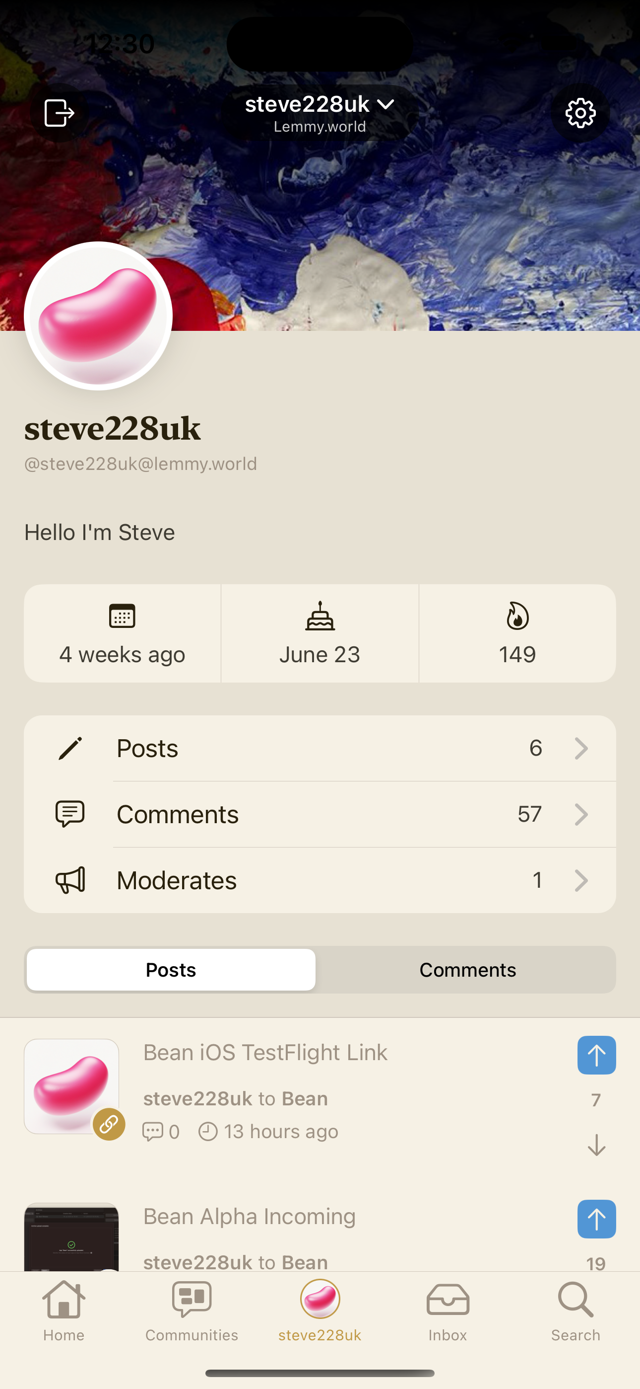



My god that icon is beautiful haha
Thanks so much! There’s a few variants in the settings 😄
Nice dab at the official app!
What did you use to make the icon?
It might seem old school, but it was made in Photoshop
Hey Steve. I’ve got a question. If I click on those screenshots the comment gets collapsed instead the screenshot going full screen. Are you aware of it and are you planing to implement full screen pictures in comments in the future?
This should be fixed in the next build. It was a regression bug due to the implementation of the collapsible comments.
You‘re faster then light buddy. Thanks a lot. I really love your app. As soon as everything is working properly I can uninstall every other Lemmy app.
Oh nice. I always make very 2D icons in Figma, but for macOS I try and make them more 3D. Not found an amazing way to do that. Is the bean shape a bunch of layer effects over a shape, or are you using an image from elsewhere and using blend modes?
It’s a flat shape with a gradient, then I went over it with the brush to add highlights and shadows with a mix of blend modes like overlay and hard mix