1st Assistant Camera and occasional Director of Photography. I work on movies, commercials, music videos and more.
Los Angeles, California
- 33 Posts
- 6 Comments
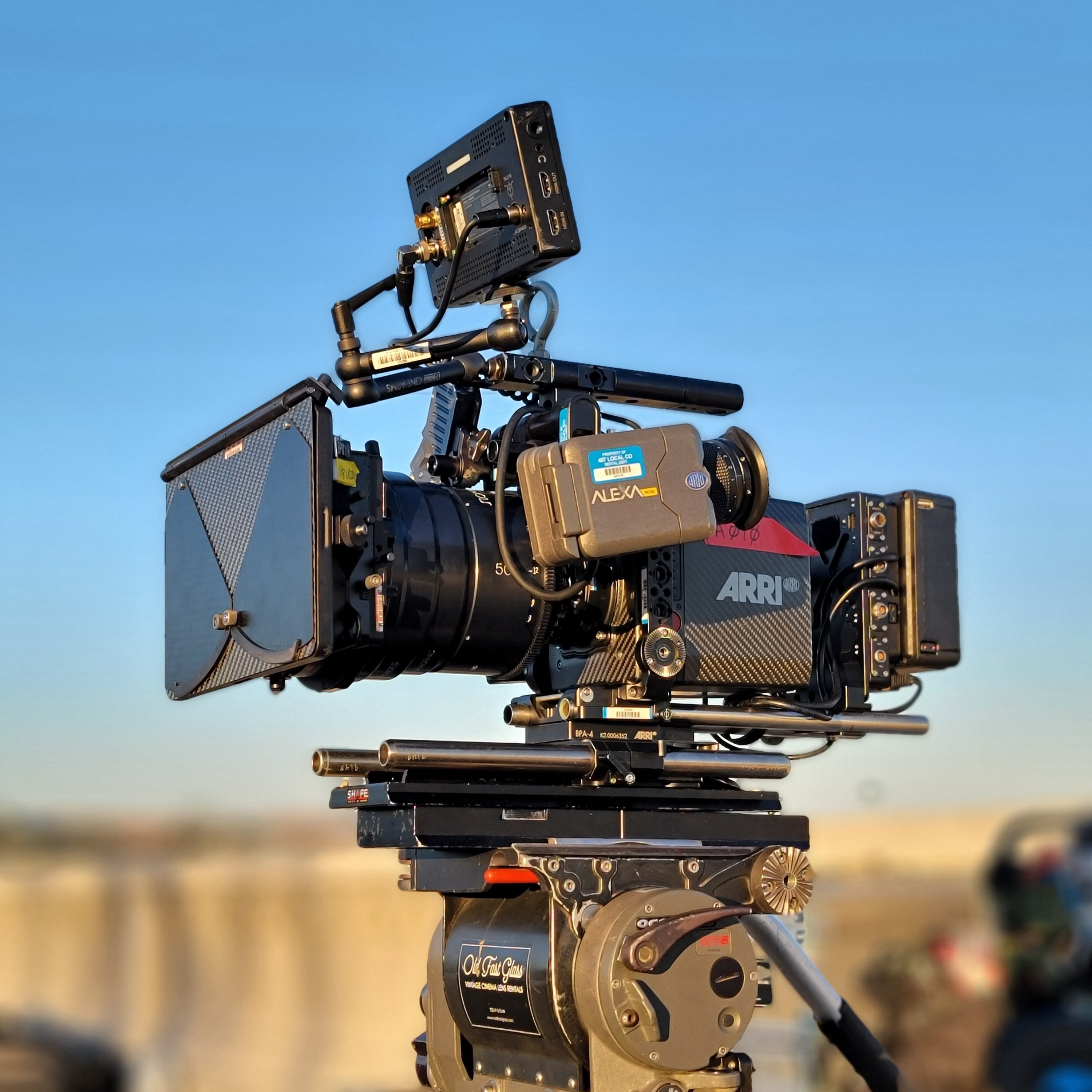
 1·1 year ago
I think I found it: BOYA BY-BM6060
Pretty cheap, not sure how great it is. The director brought it with him. It was more of a backup/b-roll mic since we used a lav for interviews.

 1·1 year ago
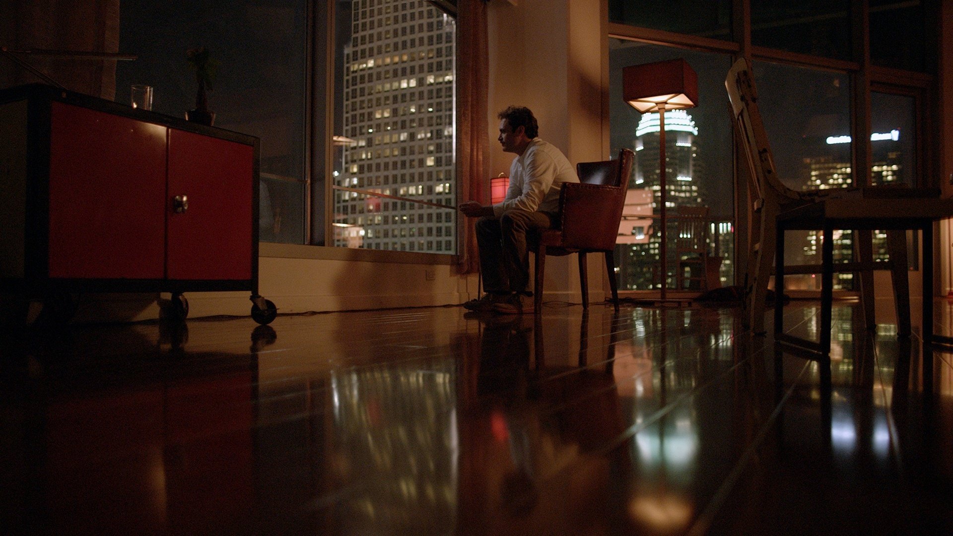
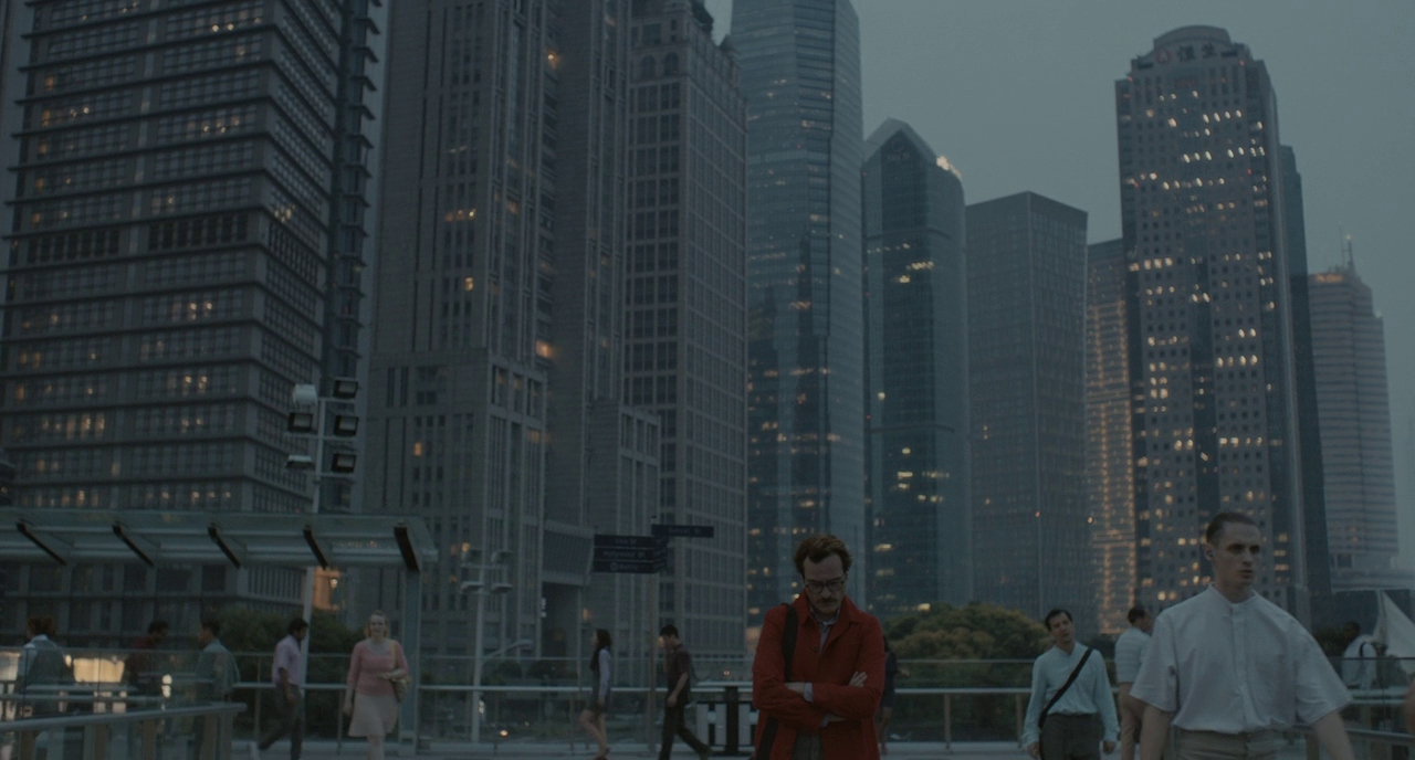
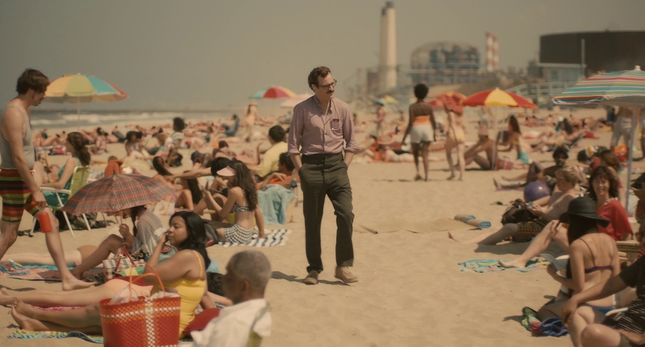
One of my favorite films of all time is “Her” (2013). The color palette, the soundtrack, the Neo-Los Angeles backdrop, and of course Hoyte van Hoytema’s lighting and composition.
Another one of Hoyt’s greats, Interstellar (2014), probably my favorite “space” movie of all time (tied up with 2001). The high contrast and highlights and his use of light/shadows in space. The use of practical lighting.
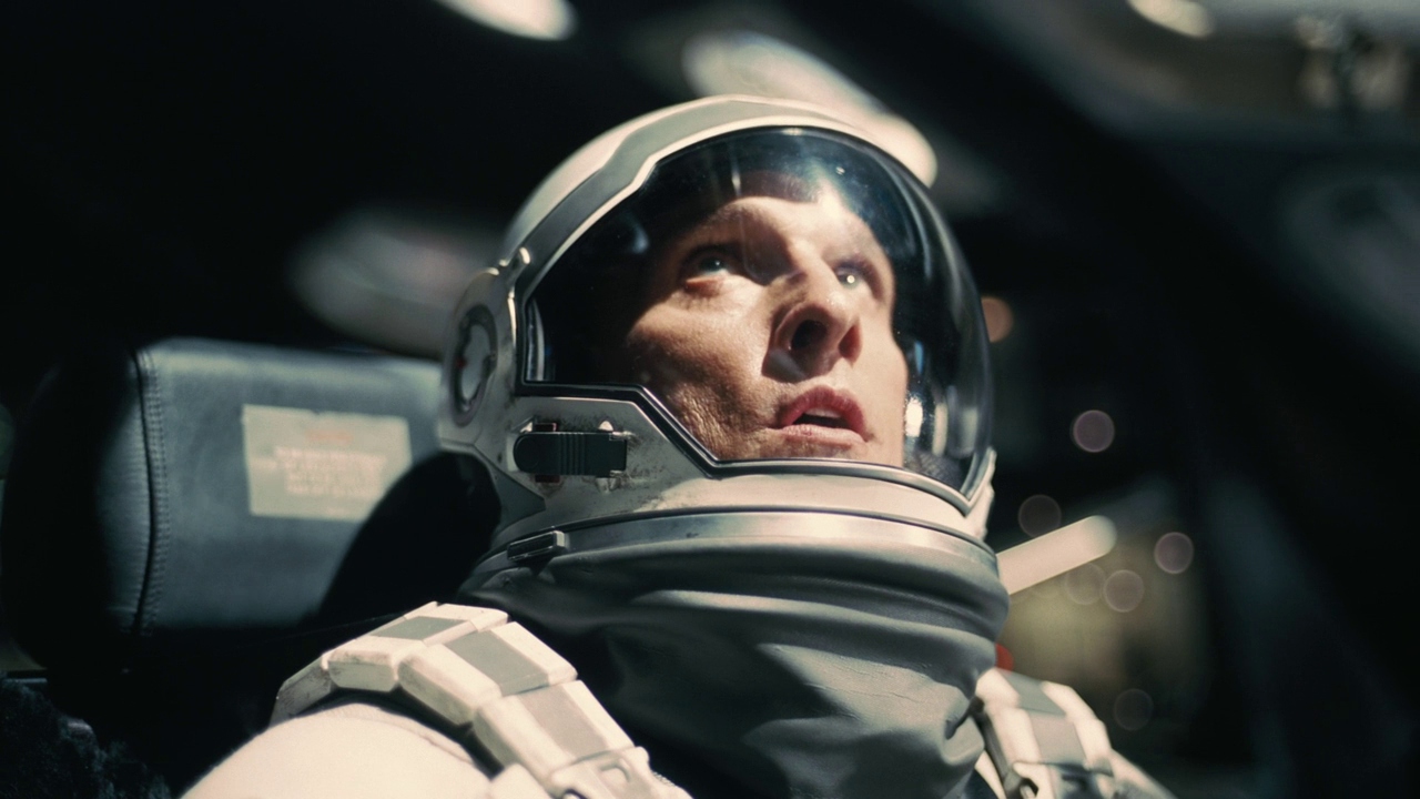
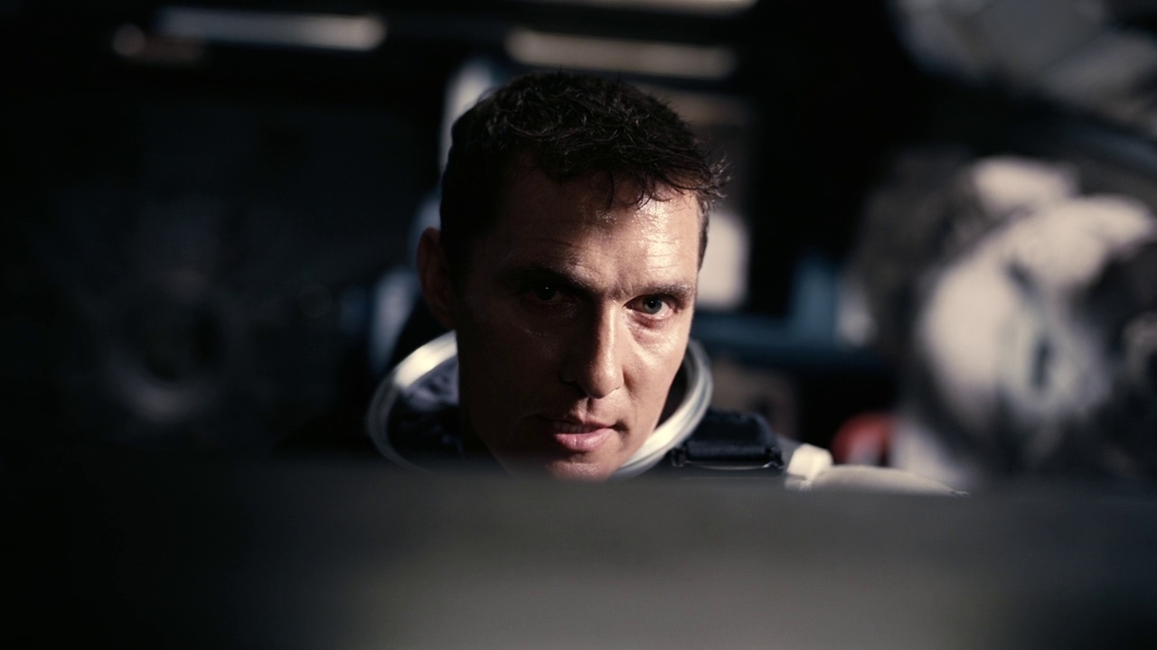

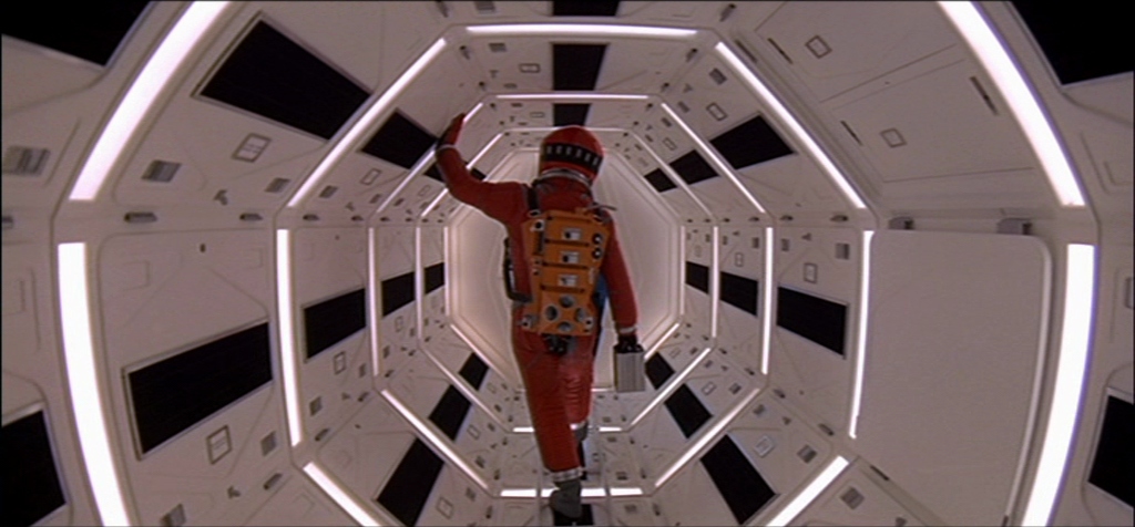
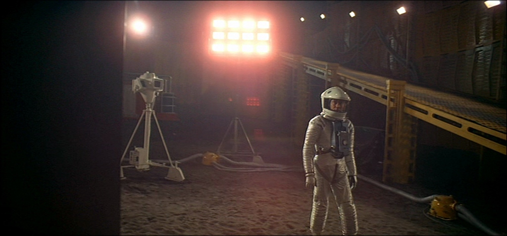
Of course it’s hard to mention Interstellar without mentioning its predecessor, “2001: A Space Odyssey” (1968). Stanley Kubrick was so revolutionary in how he was able to capture science fiction in 1968, so well that some people actually believe he helped fake the moon landing. Geoffrey Unsworth and John Alcott created the meta for science fiction space visuals.

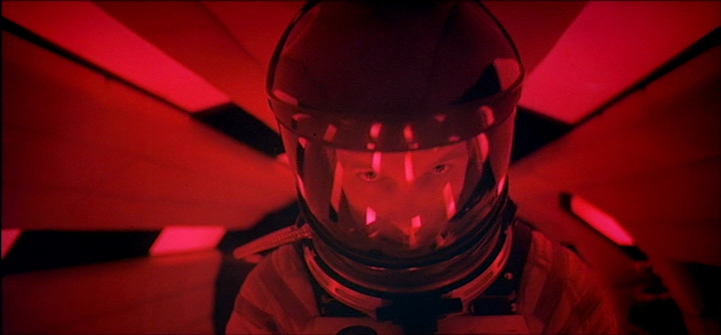
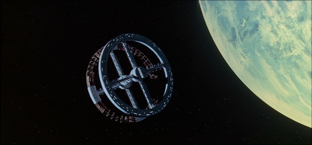
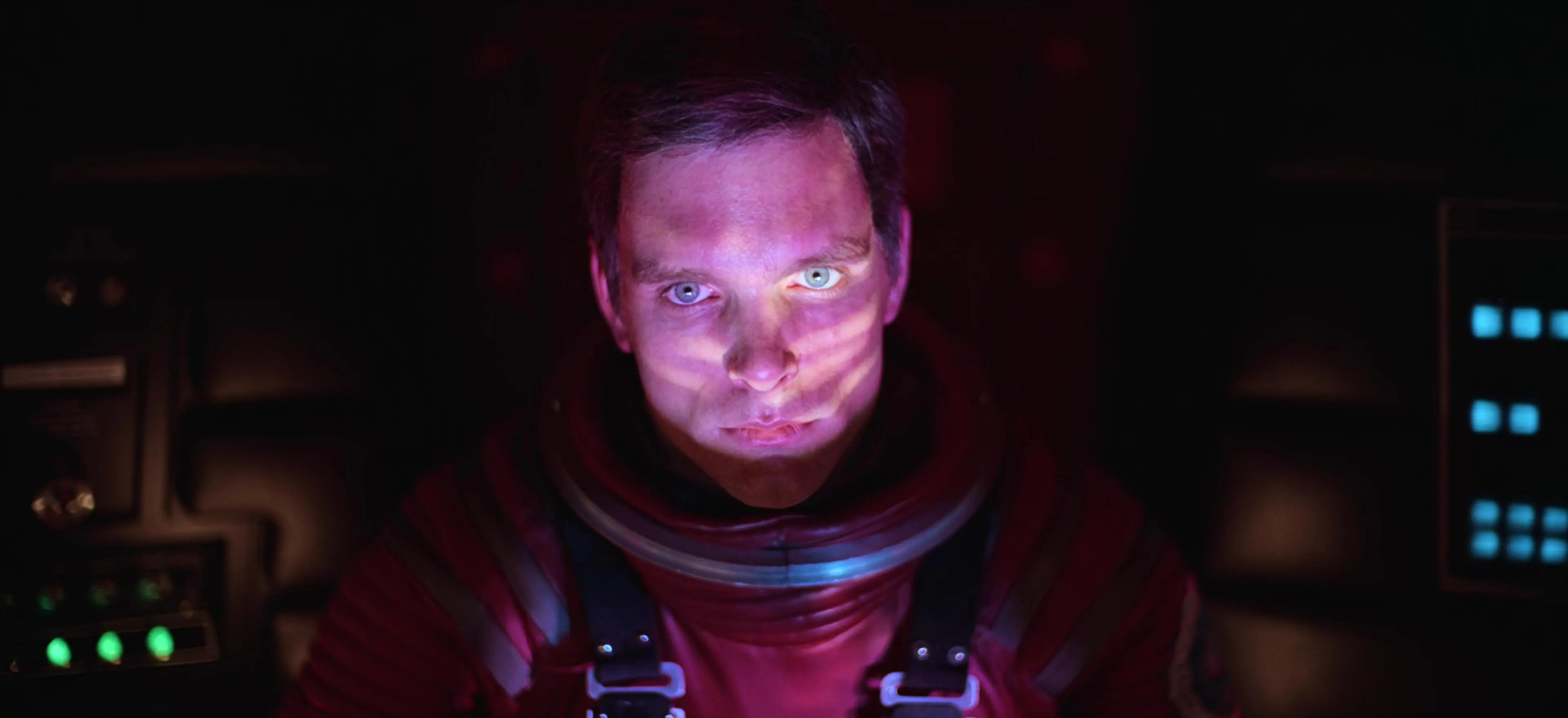
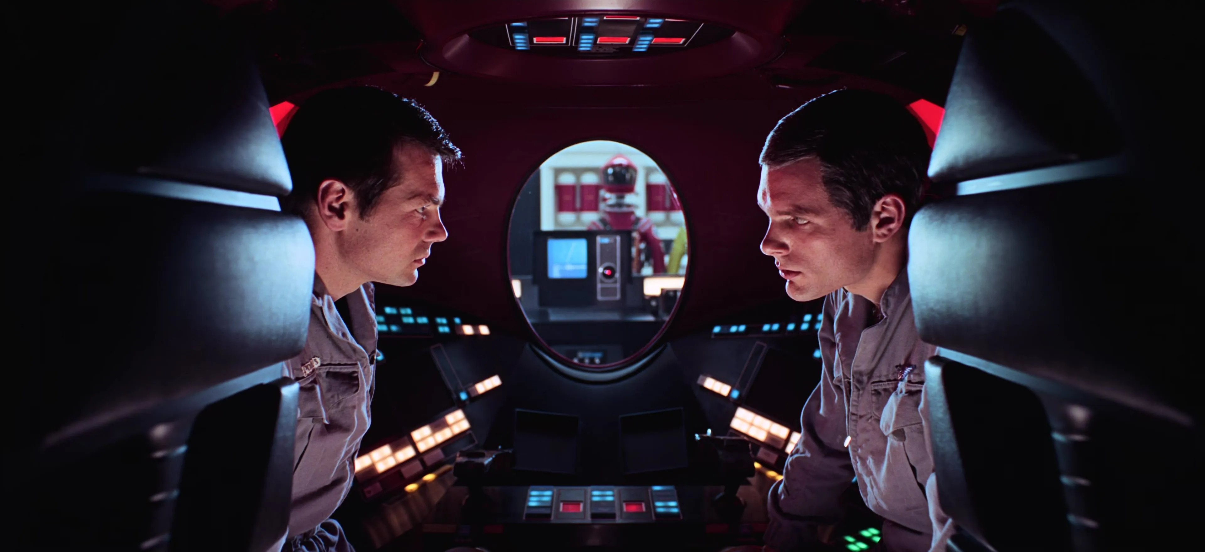
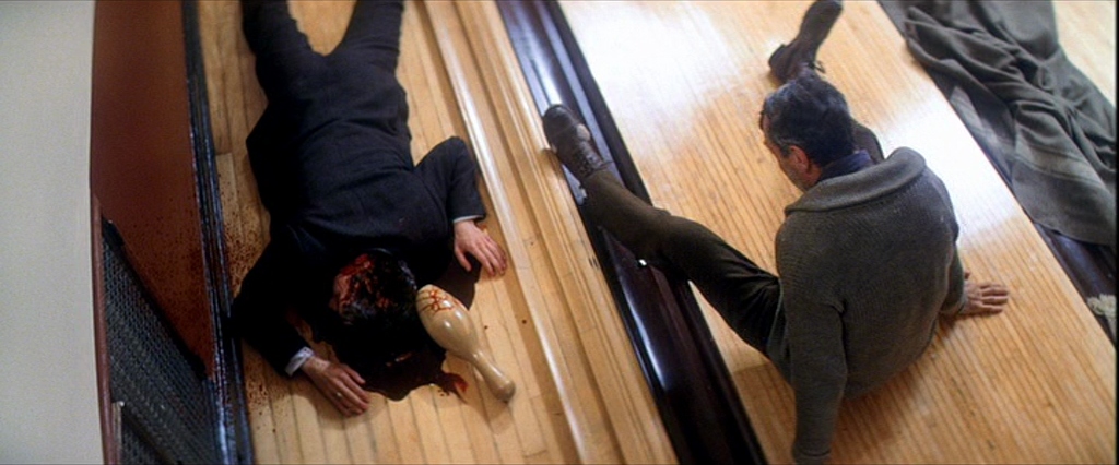
We can’t not mention the great Roger Deakins (who I seem to almost meet every week, I missed his book signing and his appearance at CineGear). Everything he has made is top tier. An all-around great movie I love of his is “No Country For Old Men” (2007). He’s a master of lighting faces and creating a perfect balance between style and reality.
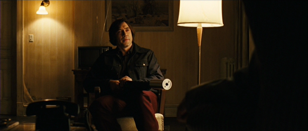
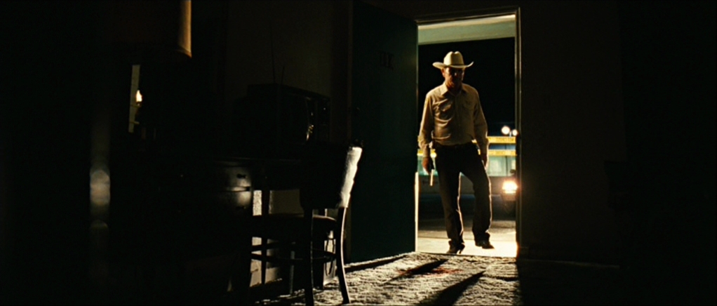
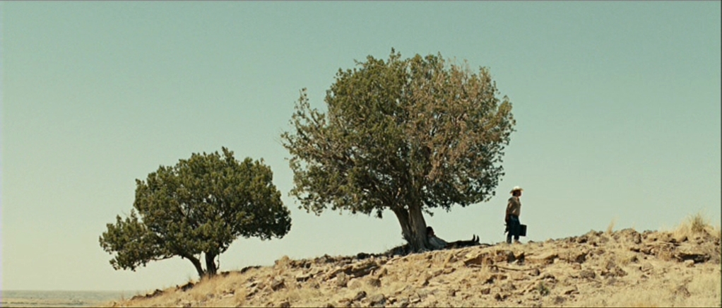
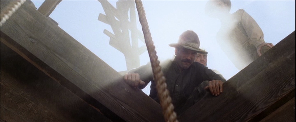
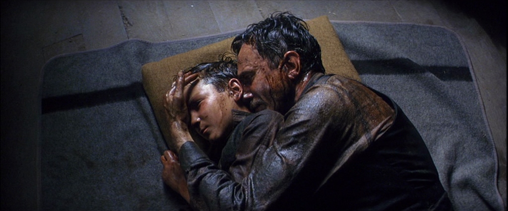
The same year (and filmed just next door to No Country For Old Men) was “There Will Be Blood” (2007). On top of the incredible performances, writing, and directing, Robert Elswit won the Best Cinematography that year for a reason.

 3·1 year ago
Yeah, it has definitely slowed down a lot recently. This was a non-union feature we shot about 2 months ago, but nearly everyone on the crew was union because none of the normal shows were starting back up, even months before the strike (because the studios knew it was coming) so the union folks were taking whatever they could get. Though this project was a lot of fun and has some very notable talent. We’re actually shooting another week of pickup shots this month to finish it off.

 2·1 year ago
That is Paramount Ranch, not too far away. Though I did find out that Melody Ranch did suffer a major fire in 1962 that burnt down much of this street you’re seeing. When we were there it felt very old and authentic. We spent about a week filming in the same saloon that was used in Django Unchained when Christoph Waltz’s character shoots the town sheriff towards the beginning of the movie. We also had a lot of live animals like horses, oxen, and chickens.

 2·1 year ago
It took four of us to carry this up the mountain by hand, on a narrow path with soft loose dirt. Was a rough day but once it was up there it lived up there for the rest of the production. This was our fake sun/moon light


Some interesting quotes from the article: