Optional@lemmy.world to Political Memes@lemmy.world · 1 year agoSee This Red Area? This Is Sandlemmy.worldimagemessage-square168linkfedilinkarrow-up11.31Karrow-down121cross-posted to: map_enthusiasts@sopuli.xyz
arrow-up11.29Karrow-down1imageSee This Red Area? This Is Sandlemmy.worldOptional@lemmy.world to Political Memes@lemmy.world · 1 year agomessage-square168linkfedilinkcross-posted to: map_enthusiasts@sopuli.xyz
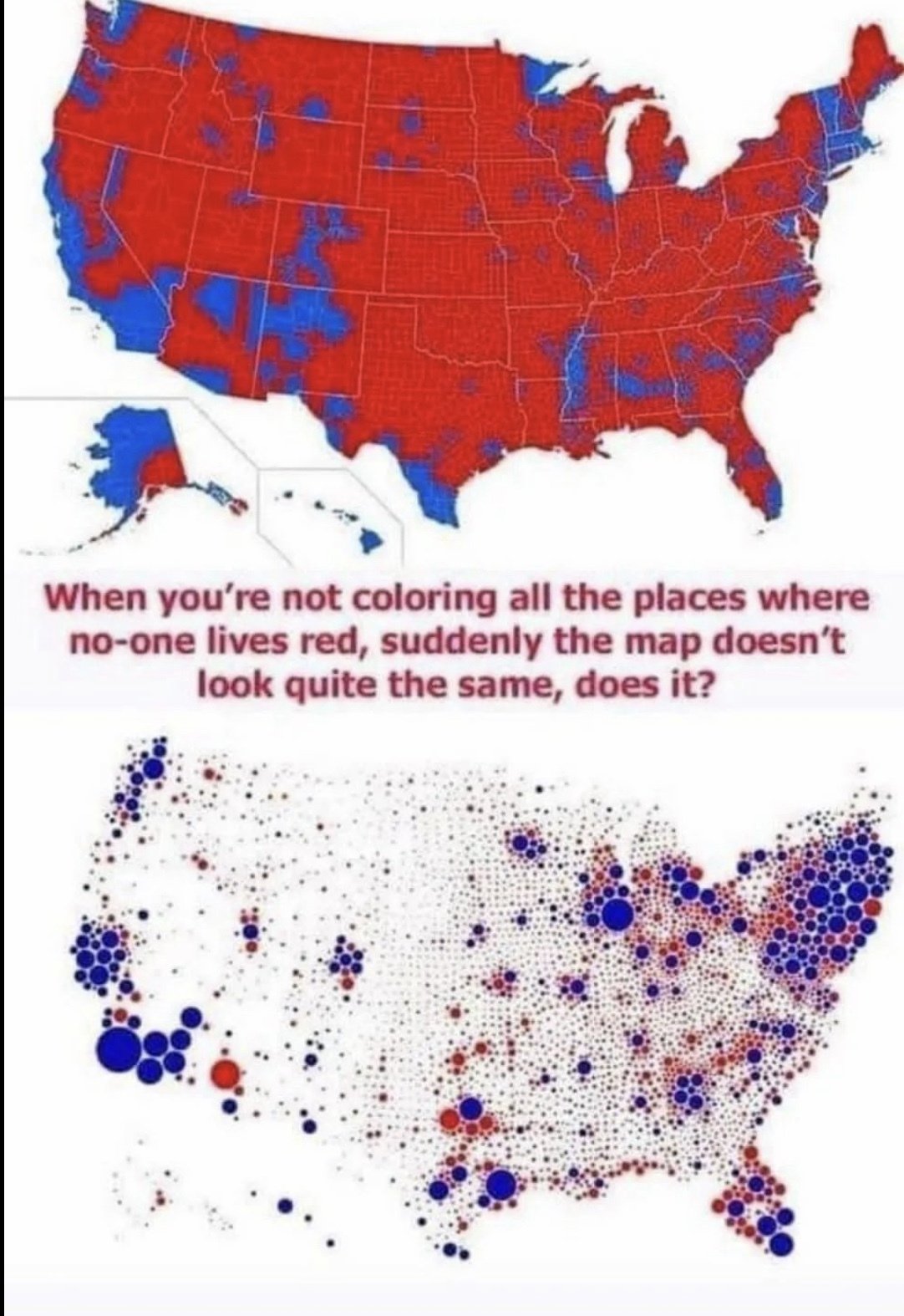
minus-squareTartas1995linkfedilinkarrow-up13arrow-down1·1 year agoI don’t think it is relevant. The xkcd points out distribution and population. The second map highlights how much more democratic the us is than republican and that is it obviously a broken system that republican’s have a chance of winning
minus-squareOptional@lemmy.worldOPlinkfedilinkarrow-up5·1 year agoagreed - love xkcd, happy to see it anytime, but it’s very specifically out of context here. Population maps are what it’s about.
minus-squareBigAssFan@lemmy.worldlinkfedilinkarrow-up2·1 year ago2nd map only shows full red or blue dots, whereas in reality each dot would be a pie-chart of red and blue.
I don’t think it is relevant.
The xkcd points out distribution and population.
The second map highlights how much more democratic the us is than republican and that is it obviously a broken system that republican’s have a chance of winning
agreed - love xkcd, happy to see it anytime, but it’s very specifically out of context here.
Population maps are what it’s about.
2nd map only shows full red or blue dots, whereas in reality each dot would be a pie-chart of red and blue.