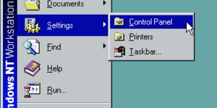
Last week, Microsoft mentioned in a support document that it was formally deprecating Windows’ 39-year-old Control Panel applets. But following widespread reporting of the change, Microsoft has either backtracked or clarified its language to remove the note about Control Panel being deprecated in favor of the Settings app. Here’s what the original post said, as also preserved by the Internet Wayback Machine (emphasis ours):
“The Control Panel is a feature that’s been part of Windows for a long time. It provides a centralized location to view and manipulate system settings and controls,” the support page explains. “Through a series of applets, you can adjust various options ranging from system time and date to hardware settings, network configurations, and more. The Control Panel is in the process of being deprecated in favor of the Settings app, which offers a more modern and streamlined experience.”
The current version of the page has changed that last sentence considerably. It now says that “many of the settings in Control Panel are in the process of being migrated to the Settings app, which offers a more modern and streamlined experience.”
It’s not clear whether this reflects a policy change or just a clarification of language. We’ve asked Microsoft whether it has changed plans to deprecate the Control Pane or if the original version of the support page was just incorrect in the first place, and we’ll update if we receive a response.


tl: “modern” means “less usable UI” and “streamlined” means “less functionality”
No no, “modern” means “includes blank space specifically for us to stick ads on”.
Less functionality as in “unable to open more than one panel at a time”
I stg Windows, every new UI is aggravating half-baked drivel.
(obligatory remark about the fact I mostly use Linux here)
I’d classify that as under “less usable UI”. There’s two different concepts in interface design: utility (i.e. can it do what you need it to) and usability (i.e. how easy and effective to use is it).
With utility/“less functionality” I was thinking about people saying they have to still open Control Panel because the “new” Settings still can’t do everything Control Panel can do after what, 12 years?
It’s somewhat bizarre to me that the settings menu isn’t just a reskinned control panel that either launches the new or old items depending on what they’ve finished so far.
I can’t imagine what they’ve done is easier than rewriting control panel items in full one by one.
You can do a halfway decent job of modernizing just by having an “advanced” toggle that shows the more arcane/less used settings.
I understand the desire to race towards a minimum viable product and get the core functionality into the glossy new thing, but they already had a minimum viable product in the control panel.
Maybe. I use Settings for quick things like Bluetooth pairing, changing monitor settings, etc. I do use Control Panel a decent amount and would never want it deprecated though.