
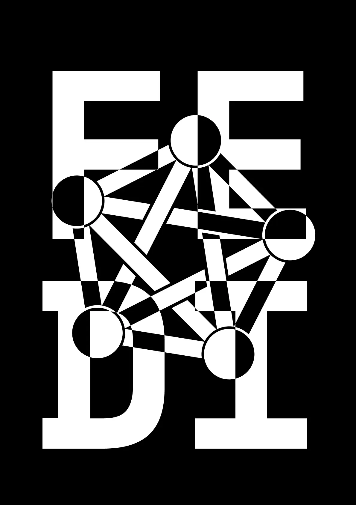
A poster I made to promote the Fediverse.
The PDFs and the light version is on the Internet Archive.
This work is public domain, so feel free to do whatever you want with it; for example print it on a T-shirt!
EDIT: Low-contrast Solarized versions are now available!
Sort of vaguely op-art. Or postmodern brutalist perhaps.
It could be a bit better thought out to improve readability and find a more pleasing interaction between the letter and logo elements, but it’s an interesting idea to explore further I think.
Either put the letters or the logo in the background. This mixing effect is just hard on the eyes and triggers even my migraine. Definitely don’t use this logo to promote the fediverse.
It’s a poster design, not a logo. It doesn’t need to be as instantly recognizable. Putting one or three other in the background would make it a lot less visually interesting.