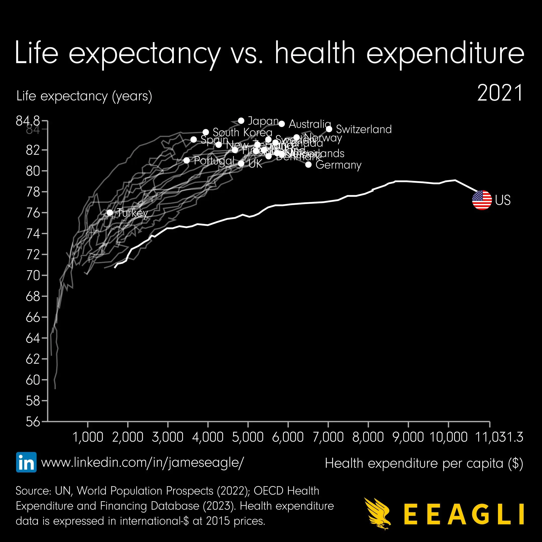
Definitely, you can see some lines in the top left zigzagging back left, which would not be possible if each was a function of the x-axis. In fact, both axes are a function of the hidden z-axis, which is time and comes in discrete yearly steps, the latest of which (2021) is highlighted.
My guess is that the line tracks what the life expectancy was when the expenditure per capita was that much? Might have to dig into their source to get more details.


…how did the line come about? How did they determine what the life expectancy would have been with less expenditure per capita?
deleted by creator
Definitely, you can see some lines in the top left zigzagging back left, which would not be possible if each was a function of the x-axis. In fact, both axes are a function of the hidden z-axis, which is time and comes in discrete yearly steps, the latest of which (2021) is highlighted.
At least one of those lines goes back on itself at some point, so my assumption is that it’s tracking where each country has been over time.
Ooh good catch. That makes sense. Not sure I would call this beautiful, especially without any way to tell how much time has passed, but fair enough
I think the line might be historical data?
But… from when? Surely expenditure hasn’t gone up linearly with time
Yeah something is weird about this graph.
Health expense in what timeframe? Monthly, yearly?
If i had to guess, i would say this graph just shows the average yearly health expense of people that died at age X
So people that spend more money on their health, live longer. If thats the whole message this is the most boring graph ever.
If the US line is true, it shows that people there get much less value out of the money they spend on their health.
My guess is that the line tracks what the life expectancy was when the expenditure per capita was that much? Might have to dig into their source to get more details.
There is a minimum amount which is likely the least some people spent on their health. So there is no interpolation I can see.
That doesn’t make sense unless this was personal expenditure, which it doesn’t seem to be