
“Today we begin the final phase of this major change where Aptos will start appearing as the new default font across Word, Outlook, PowerPoint and Excel for hundreds of millions of users,” explains Si Daniels, a principal program manager at Microsoft, in a design blog post today. “And, over the next few months it will roll out to be the default for all our customers.”“Today we begin the final phase of this major change where Aptos will start appearing as the new default font across Word, Outlook, PowerPoint and Excel for hundreds of millions of users,” explains Si Daniels, a principal program manager at Microsoft, in a design blog post today. “And, over the next few months it will roll out to be the default for all our customers.”
I’m not sure I understand why they want to replace Calibri, but I guess a fresh typeface every now & then isn’t a bad thing.
What do you all think of this Aptos?
You must log in or register to comment.
Although I prefer Aptos over Calibiri, the change isn’t that drastic. Aptos kicks the absolute fucking shit out of Calibiri when it somes to common symbols like @ ; and ?, but it’s slashes don’t match, which is a choice.
MS should’ve been been more bold, and make something like Conthrax the default.
I don’t know:
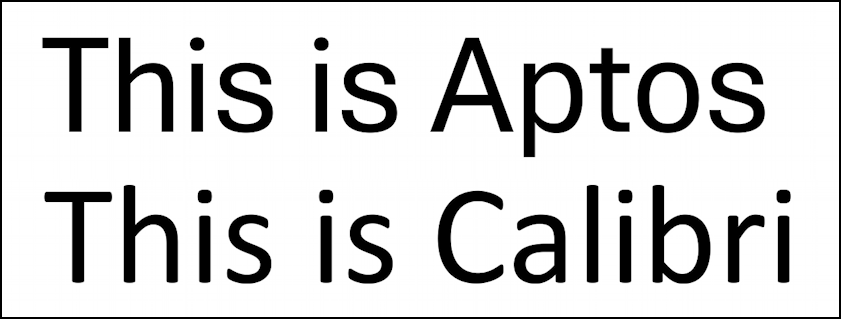
To me, that makes Aptos look kinda square/blocky, at least this variation, compared to Calibri. I can’t seem to find the full typeset though. Do you have a link to something showing all of the characters?
Aptos: grotesque/neo-grotesque, more in common with Helvetica/Arial.
Calibri: humanist, squarely in the Frutiger
knockofffamily.Tangential: strange though how brief Calibri’s reign as default font was, even after the US Government declared it the official document font (replacing Times New Roman) by resident typography expert, Antony J. Blinken.
Apparently, I’m a Frutigerphile. :)
Any ideas why sans serif seems to be taking over the world? I generally find serif fonts easier to read, at least when the medium has the necessary resolution to properly render them.
Anyway, I’ll continue make sure that all my stylesheets are based on Garamond. :)
Sans serif and display fonts in general are designed with subpixel matrices in mind. How well they succeed is another thing entirely. You could easily design a serif font that’s display friendly (see most monospace fonts) but they often invoke different feelings than a display font. That combined with the fact that Microsoft wants to push neumorphism, and font choice is part of that redesign, it makes sense to phase out calibri which was designed to fit with the flat look of metro design
Thanks for the explanation.
I’ve long used (and preferred) san serif typefaces for screen interfaces and find them acceptable for the shorter passages associated with screen-based communications. I still switch out to serif fonts for anything that will be printed out and usually do the same for on-screen reading of books and magazines.
Sans serif on paper just looks wrong to me, unless it’s some kind of heading, in which case I tend to prefer it. Maybe that shows my age. :)
No I get that as a Palatino lover
Wait, is Microsoft’s current “fluid” design language considered neo skeumorphism? (Also thanks for sharing the term neomorphism with me! I hadn’t heard it shortened like that!) I haven’t really followed Microsoft’s ui design at all, I wasn’t aware it fell into that category
Fluid is neumorphism and glassmorphism having a baby. Elements have depth and transparency but there’s still some abstraction from skeumorphism because we’ve gotten used to computers a bit more but we want textures again.
Huh, I guess I’ll have to go take a look at fluid again, I hadn’t really followed it at all since it was first being talked about as their new design language. Thanks for filling me in!
I think it’s alright. The bold looks particularly nice.
Yeah, I quite like this one. I don’t think Calibri is a particularly nice font, and it’s tired. (if anyone heard about the new office font plan like 2 years ago, this is Bierstadt renamed).
Huh, I thought I had broken something when everything changed to this font a few weeks ago. That explains it. It is much better than Calibri.
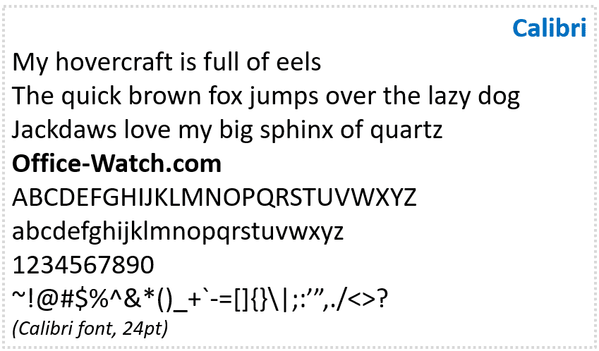
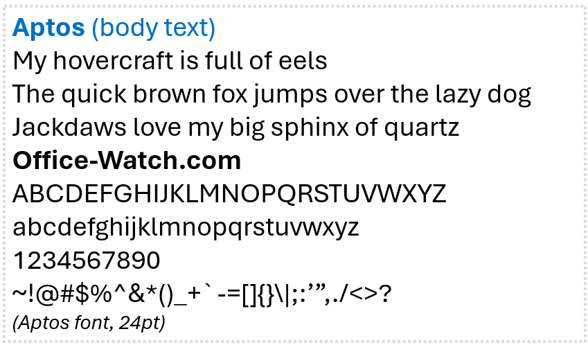
Here is a good comparison of both font types: https://office-watch.com/2023/aptos-calibri-comparison/
Ibe always been a Calibri (and Segoe UI) Fan, but Aptos looks nice as well.
Well, isn’t that a neat horizontal slider for this comparison? Thanks!


