Changes in version 1.5.0
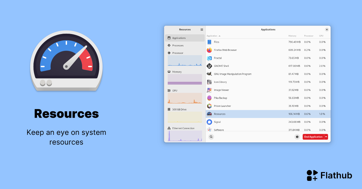
Resources 1.5 has landed and brings with it monitoring for batteries along with the usual bug fixes and improvements. Enjoy!
🐛 Bug fixes
- If the Processes view was the last opened view and the “Show search fields on launch” setting was enabled, the search bar was not automatically focused
- Graphs in the sidebar were reset when a drive or network interface was added or removed
- App icons were not shown for user-wide installed Flatpaks
- The calculated amount of logical CPUs was wrong for systems with multiple CPU sockets
✨ New features
- Resources can now monitor connected batteries
- CPU usage normalization can now be toggled off
- Total read and write stats for drives
📈 Improvements
- Graph colors have been revamped to avoid low contrast situations and improve consistency within views
- Some keyboard shortcuts were changed to avoid clashes with standard shortcuts
- More stability when performance statistics could not be determined
- Some entries in the settings dialog now have subtitles
- If a drive has no model name, its block device name will now be shown in the titlebar
- Small accessibility improvements


I’d call gnome system monitor good enough but out of place from a layout perspective. Its looked the same for as long as I can remember
I also personally don’t like the mission center layout as much. It feels like they copied Windows for no good reason. However, that’s just a personal preference
They definitely copied Windows but Windows’ Task Manager is honestly one of the few things I actually like about Windows. My issues with Gnome System Monitor is that it’s missing important information, information isn’t easy to read, I don’t think there’s a way to stop an application and it doesn’t look good.
It probably will be rewritten at some point. For now we have the resources app