- cross-posted to:
- linux@programming.dev
- linux@programming.dev
- cross-posted to:
- linux@programming.dev
- linux@programming.dev
You must log in or # to comment.
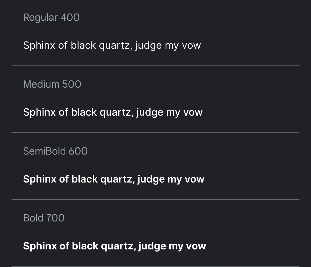
It looks very Apple.
That’s not necessarily a bad thing, but Cantarell has an iconic look to it that just screams “GNOME”.

I just want them to improve font rendering in general. If they’re gonna go Apple, at least copy their font rendering.
I agree. Linux font rendering definitely feels inferior to Mac and Windows.
one of the first things I do after every install is switch to inter, this will save me a minute every couple of years so I agree


