
- cross-posted to:
- google@lemmy.world
- cross-posted to:
- google@lemmy.world
cross-posted from: https://lemmy.world/post/17574522
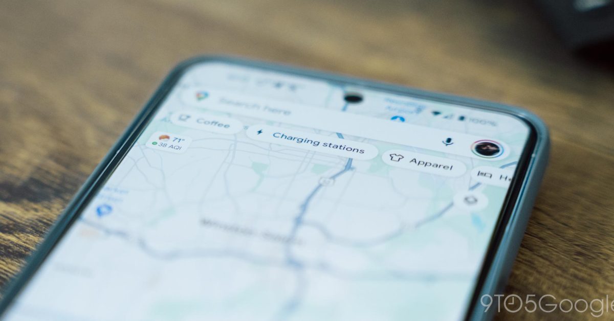
Over the course of 2024, Google Maps for Android has been working on a redesign that drops most fullscreen UIs in favor of sheets…
deleted by creator
MD sucks balls, I despise this crap. It makes a less obvious distinction between elements to look cool, or new or intriguing, or different, or whatever bullshit UI designers come up with.
UI everywhere has been going backwards for 10-15 years now. Giant ovals with text for the Quick Settings buttons is an improvement? More swipes is better? Less contrast in a browser/app window is better?
Oh yea, let’s remove color from status bar icons 🤦🏼♂️
deleted by creator