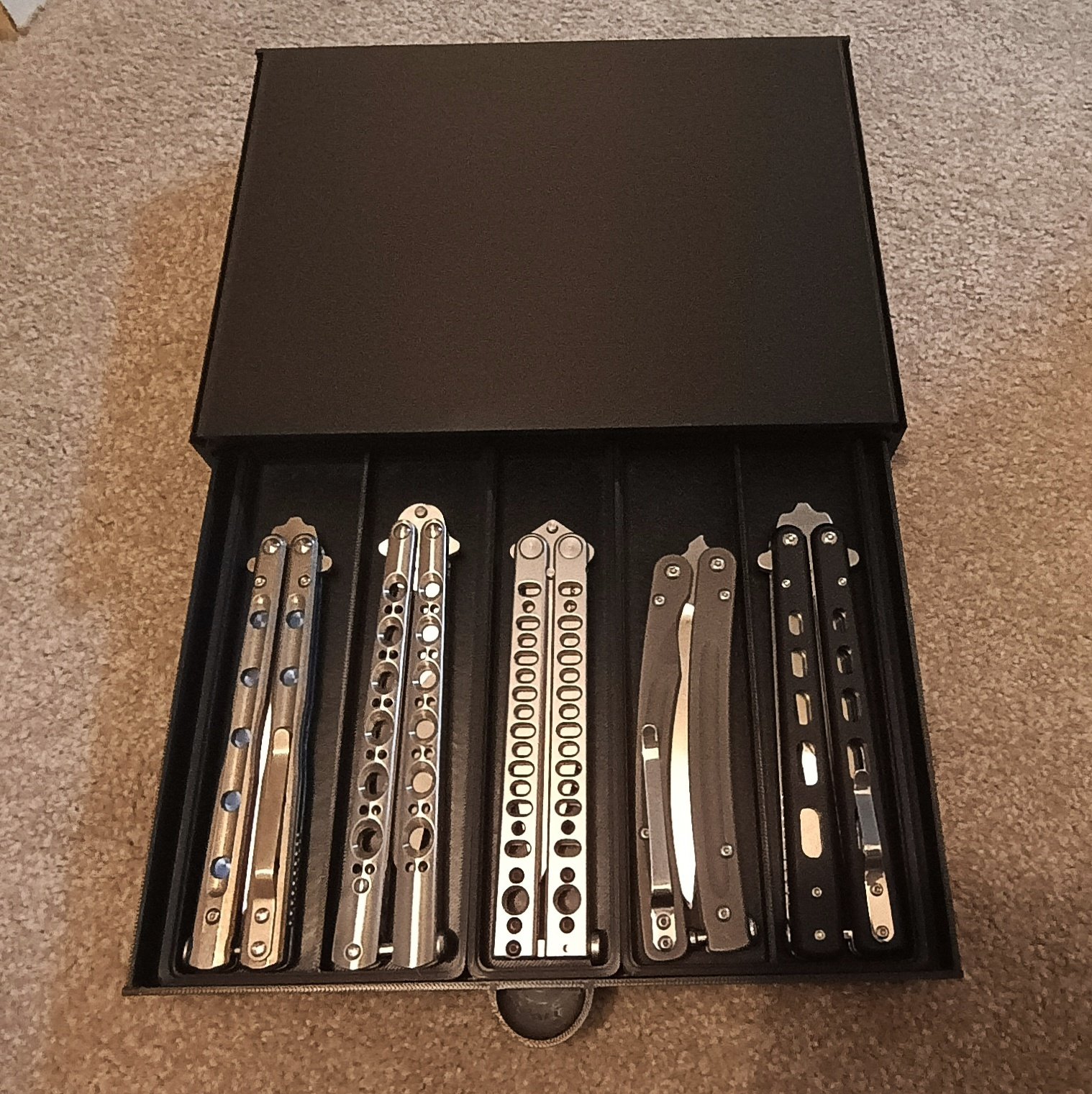
Wouldn’t you know it, I’ve been messing with the current release candidate for FreeCAD lately. Just now, I used it to make this.
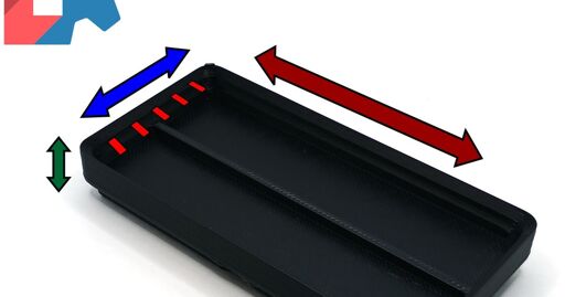
I got annoyed at having to search through all these multipacks of files to find a Gridfinity bin in the size I want. So I decided the hell with it, and made a parametric configurable FreeCAD model that creates bins or you, in any size (within reason) and also with a configurable number of fixed dividers in the bargain.
My main intent was, of course, to use these to organize oodles and oodles of pocketknives. You’ll never be able to guess why. But if you have a use for it, knock yourself out.


Other than the attempt to obfuscate the TNI and multi-object bodies, what else have they changed in FreeCAD? I haven’t kept up with it, but have seen stuff in passing like Mangojelly’s titles/thumbnails. I like that I learned the proper old skool CAD ways with the TNI, so I kinda lack much motivation to follow the latest nightlys. I’m not trying to gatekeep or anything. It was deeply frustrating to learn the important ins and outs of the topological naming issue and why all proper design revolves around it. If I stayed informed I’d likely be vocal about how people will (likely) fail to learn why things still break in ways they do not understand even though it is entirely their own fault. So I stay a little distant for now and have done so ever since the real thunder drama. Anything new of note?
I haven’t delved deeply into the changelog or anything. The headline features are indeed integrating much of realthunder’s toponaming fix into the mainline release as well as including an assembly workbench by default which I believe is also realthunder’s. This is pretty big, because realthunder’s fork was perennially behind the mainline release by several versions, and now the main reason for using it renders that moot. So that’s nice. I generally work in such a way as to not get burned by the toponaming problem anyway, but I guess I get the warm and fuzzies knowing I may avoid unexpectedly being bitten in the ass at least once now.
The UI has been changed around a bit, in particular many things that used to be out in the open in toolbars are now in overflow menus which is probably beneficial for people who don’t design on a 4k monitor. But I do, so that doesn’t excite me any.
The renderer appears to have been updated. When you change views now, your viewpoint animates to the new view instead of just snapping to it. It seems it does a better job of keeping things in frame as well, both when you open a sketch that’s not currently on your viewplane and also when you switch views. Additionally, when you’re free rotating your view there’s a little red dot that shows your rotation point now. This was a bit opaque in previous versions and now it appears to default to originating where you clicked, whereas previously your rotation center was… whatever the hell random place it felt like putting it, near as I can figure.
You can undock the “Tasks” panel now and even close it outright, which I like because I never use it for anything and previous versions incessantly switched you out of your tree view and into Tasks e.g. when switching between workbenches.
The measurement tool is much easier to work with now, i.e. it works how you expect it should have worked in the first place, and also produces labels that are significantly easier to read. I avoided using it before because it was such a pain in the ass. It’s usable now.
Every measurement now defaults to whatever your projects default units are, even if you don’t specify one. This kinda-sorta worked before, but things like formulas would absolutely insist that you append “mm” or “in” or whatever to every single number or they’d break, which was deeply irritating. Now it just works as you’d expect, which again feels like how it should have worked in the first place.
Help’s not an add-on anymore. I have no idea why it ever was. I never use it, but once again: It should have worked the way it does now all along.
I notice you can drag things around inside the tree and more of them allow themselves to be reordered that way, although not all. Notably not sketches within a body, which is an issue when e.g. doing lofts, and the order of the sketches matters. So there’s improvement there, but still more work to be done. (You can still reorder them with the right click and “move after another object” option. But it’s clunky.)
The start page is different. It still doesn’t track the same recent items there versus what’s in your drop down file menu, though, and I still have no idea what that’s about. It also tracks exported files like .stl’s as “recently” accessed items, which I guess is technically correct but I suspect is also beyond useless for 99.9% of workflows.
All in all, there’s plenty of stuff I like about it more than I did 0.22, and not much new or changed that really pisses me off or messes up my workflow.
There has been an effort improve the usability of the GUI. And a pointed effort to create a unified and default assembly workbench that actually works, (it seems off to a good start). Some improvements to the CAM workbench and several others. But much of what other things have been done are relatively minor like improving the solvers ability to create fillets and chamfers without failure.
But honestly, Ondsel has been very open that the main goal with the 1.0 release is the TPN resolution and far less about new features.