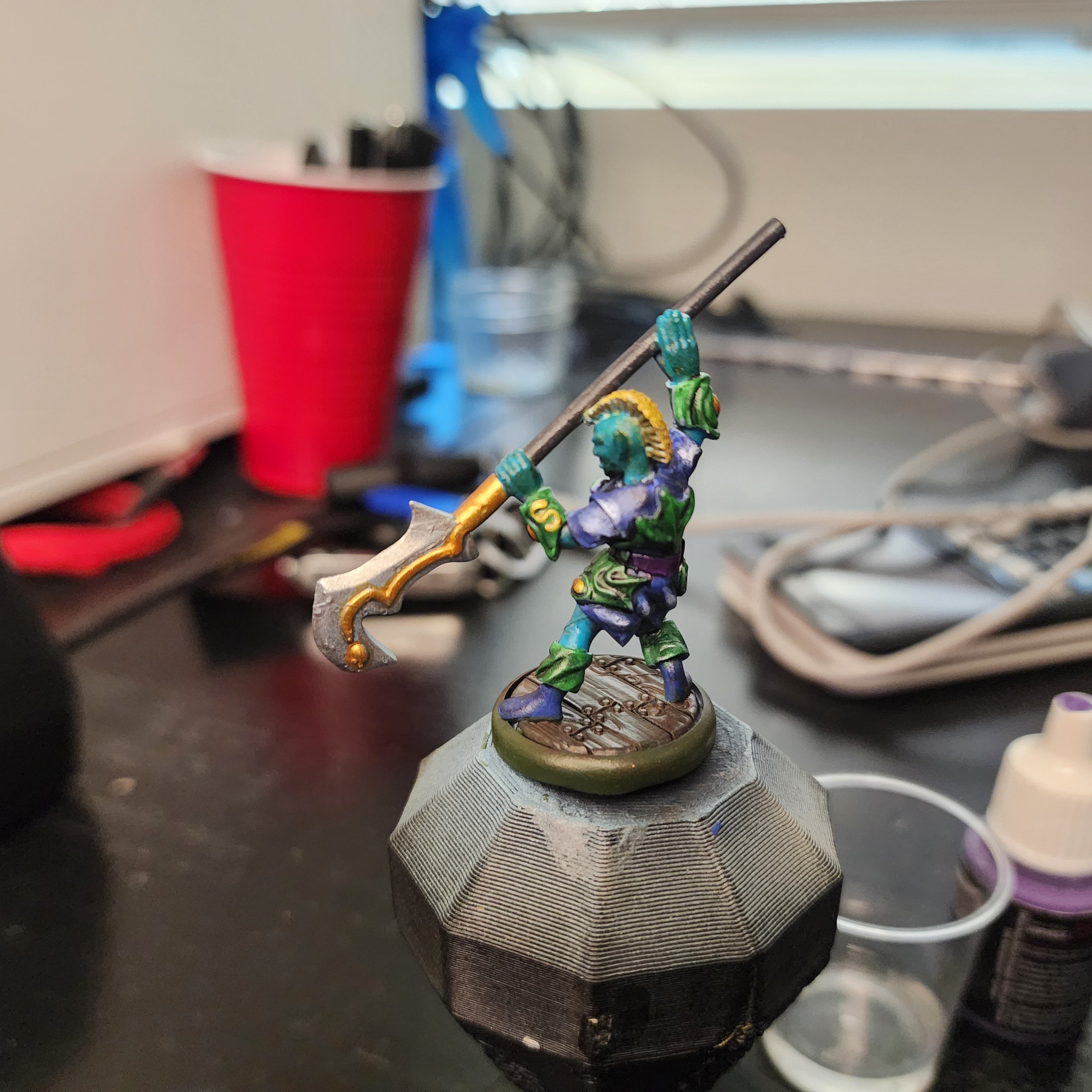
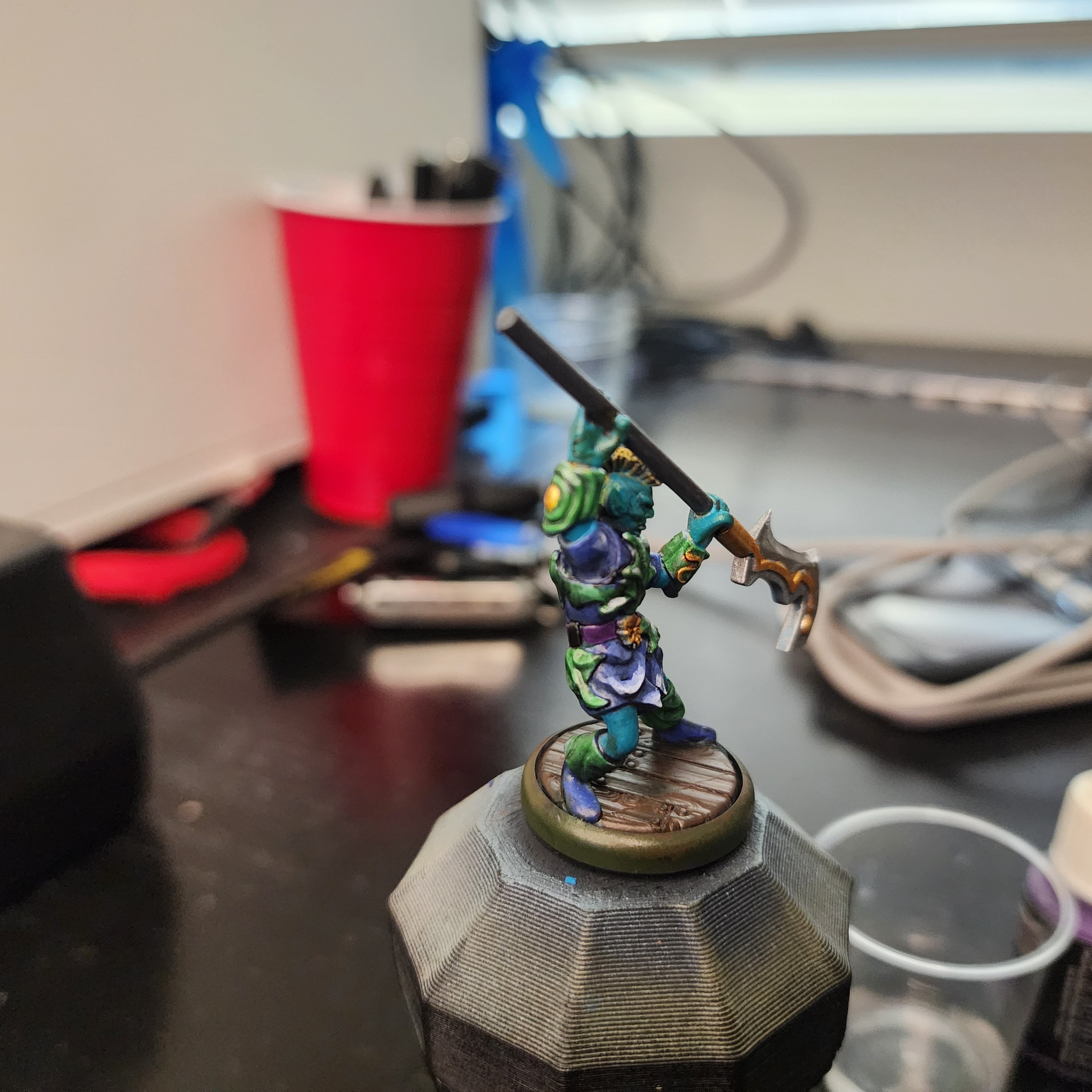
This is one of the characters from Valandar’s second Player Character pack. His weapon made me think of mer-people, so I wanted to paint this guy with an aquatic theme. About halfway through I realized the color scheme wasn’t going in the direction I wanted, so I abandoned the aquatic theme and just picked colors that I thought would look good together.
After applying the final wash, I felt the model looked too dark and monotone, so I decided now was a good time to give edge highlighting a try, something I’ve always been too lazy or impatient to try. Holy crap, does a tiny bit of white make a difference! You can see that my blending and edge selection leaves plenty to be desired, but for a first time, I think some parts of his robe look really cool.
As always, here are a few more angles:


If anyone has any advice or pointers for color selection, I’m all ears. For this guy, I started with the color I knew I wanted to make a bulk of the model (blue/ aquamarine), picked a few nearby colors (green and purple) for the secondary bits, then jumped across the color wheel (yellow and gold) for the highlights. I think the model has good contrast, and the colors look ok together, it just doesn’t have the look I was going for. I’m sure I’ll get a better eye for color selection as I continue to paint, but if there are any places to start looking I’m open to pointers.


For your ask on c&c, I think your color choices generally are good. If I were doing this, I’d start by basecoating all the areas as the darkest shade of their color, and then painting up from there while keeping in mind important deep folds like the fingers and the borders between objects. Paint up to a very bright color. Maybe some volume highlighting if you are feeling adventurous- I usually imagine the light source off over one shoulder or the other. Minimal use of washes, and any washes only used for lining and not for all over the surface. Using a black or dark blue or purple wash to line different objects to give them distinction from each other if needed. My goal would be bright and crisp, with well defined shapes.
Specifically for a yellow Mohawk, I’d paint it orange first and then go with yellow highlights, moving up to yellow-white at the corners and tips.
For any of the gold, if you paint the area purple first and then gold atop, while letting the purple show at the edges and recesses it gives it some depth. A tiny bit of silver to highlight the gold at the highest points helps.
Man, thank you so much for this. I’ve learned a ton from your tips. I’m taking a short break from miniature painting to work on some larger pieces, but having the fine detail skill helps to make parts of my larger models pop.
I’m working on a small-mediun Poseidon statue now, and I’m mimicking the color scheme from my “blue skinned half giant” per request. Already I’m enjoying the skin tones much more because I’ve learned a good amount since then.