

- cross-posted to:
- phoronix@lemmy.world
- cross-posted to:
- phoronix@lemmy.world
You must log in or # to comment.
Meh, not bad, not terrible.
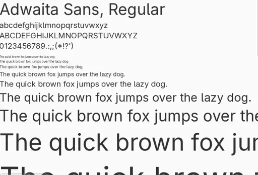
I would say the Ubuntu Font was bold move. Quite unique, easy to read.
Similar Fira Sans, it has something.Generally “humanist” fonts are interesting.
deleted by creator
Ubuntu uses the Ubuntu font. It’s their barnding font and they’ll probably stick to it.
Isn’t the Noto now?
Probably depends on WM/DE.EDIT: Just checked Kubuntu 24.04 live, it’s Noto.
Kubuntu is no longer primarily developed by Canonical. That might be a reason why it’s different from regular Gnome Ubuntu.
💔😖
