

I don’t know why they didn’t use that tagline in 1986.

My “Of course that’s a thing.” daily meter has been met.
They don’t teach the classics in school anymore.
Artists link?
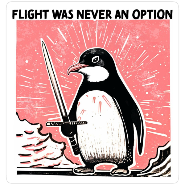
Text and style in some areas give me AI vibes…
The text gave me those vibes at first, but a closer look makes clear it’s actually a font that is intentionally misaligned. The As, Ns, and Es look exactly the same as each other, in a way that doesn’t happen with hand lettering or even AI generated text. The bad spacing around each character is consistent, too. It just looks like a poorly designed font.
It would look great on a t-shirt, hopefully the artist sees some of that
“And there it lies. Some sort of smol software, slain.”
I’m a simple man. I see AI slop I downvote
Yeah, show me more regurgitated memes, please.
Well that barely narrows it down. There are still three Fs left: fight, feed, and f… reproduce.
Also is that the rage guys light saber from Star wars? Kyloe Ren? Is this penguin evil?I looked at it again, it’s not a light saber at all.


