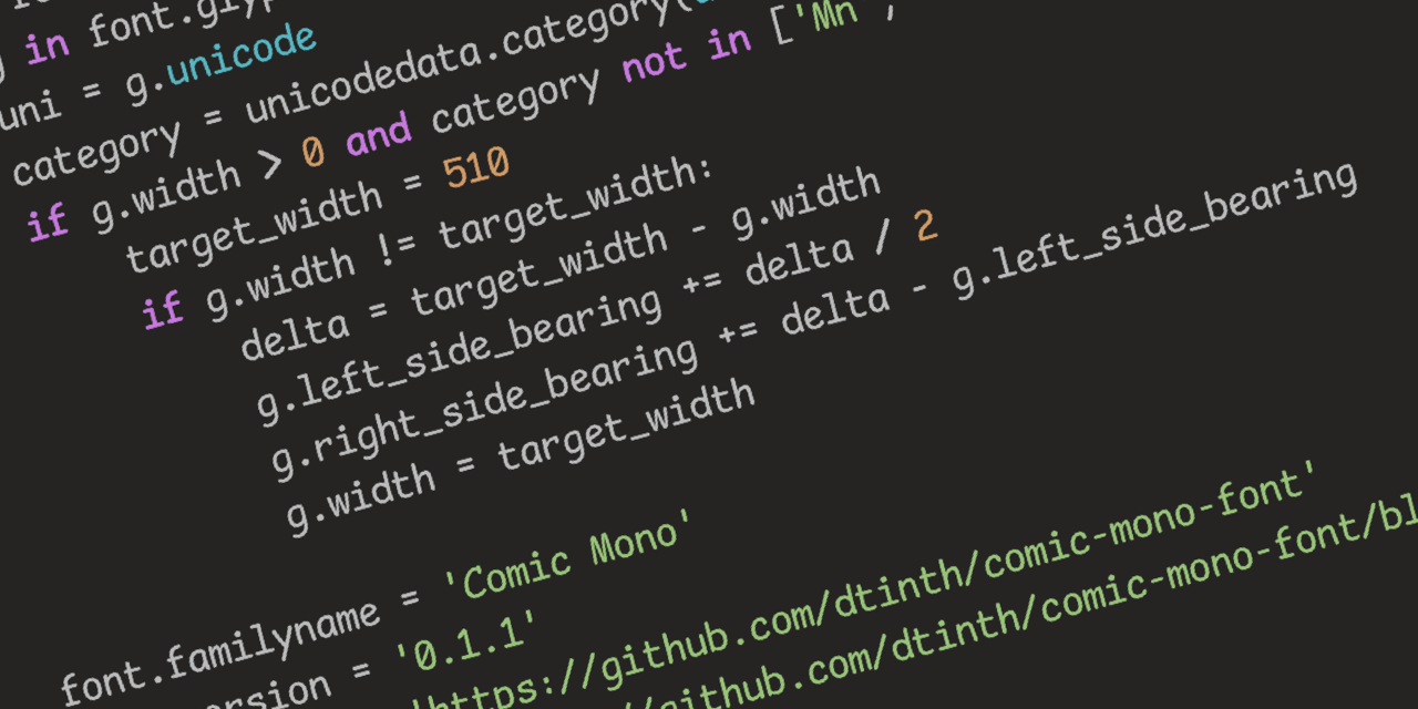
Seriously, though, Comic Sans was originally designed to be legible at the smallest possible font size, and the lack of hard lines makes it easier to read!
I…don’t hate it? Why am I not horribly offended by this?
Same thoughts here. Went in expecting to hate it instantly and found that it sort of looked nice.
This has me rethinking like two decades of coding. wtf.
I think some of the reason might be that Comic sans used to have really bad kerning. But with a mono font it is not really an issue.
Yeah, this has me intrigued. May try it out in vscode just for a lark. Possibly actually will be easier to read with some nice shapes…
I feel the same way. I hate that Iike it and am now going to try it.
Oh no, I was ready to pick up my pitchfork, but that is super legible. Brb, I need to go take a look at myself in the mirror…
Definitely makes sense considering some dyslexic people have found it helpful in terms of legibility
Yep, it shares a lot of characteristics with fonts like Dyslexie, but without some of the more irritating (but helpful) gravity additions that throw off non-dyslexic readers and/or just look odd.
The additions throw off some dyslexic readers too, I’ve always had an even harder time reading purpose-built dyslexia fonts. Comic mono is top tier for me, it still looks stupid but the readability is incredible.
I didn’t want to wake up and start liking comic sans, God damn
First of all, how dare you
Second of all, how dare you
Third of all, at least it isn’t papyrus
Papyrus!!!
This looks way better than it has any right to, I expected to hate this. Now I’m looking at fonts again reevaluating some shit
I came here to get mad but comic sans monospaced looks really good. I’m impressed. I might switch my IDE to this.
Reducing the font-size makes it look pretty great.
deleted by creator
Looks to me like it has a ligature that visually appears as two separate characters but are spaced to be close together. See the
<=in the code examples on the page.
⚠️ I have reported this post to the proper authorities.
Title is misleading, it’s a monospaced derivative of Comic Sans that’s actually nice, not actual Conic Sans.
Conic Sans is the hyperbolic version of Comic Sans
I miss RES’s context feature now. Thank god this thread wasn’t too long, so I was able to find my comment you replied to in it in a reasonable amount of time.
Oh no now I want to build a whole Arch rice around that font.
…no that’s not enough.
we need ComicSansOS
Holy man! If you ever do that. Please post! On unix porn as well!
Is there a Lemmy community for that yet?
https://discuss.tchncs.de/c/unixporn@lemmy.ml There you go.
Wow, poor comic sans didn’t deserve all the hate it got
I mean Comic Mono is mentally relaxing and legible so great font of choice
I see serifs. You’re a phony! A great big phony!
Comic Serif just doesn’t have the same ring. Times New Circus?
Clown Gothic
If you like that, check out Recursive Sans & Mono
I wouldn’t pick it over Fira Code but it has a bit of whimsy to it that reminds me of Comic Mono.
That is so cool. I have no idea what to use it for but I just spent 10 minutes playing with the sliders.
*Really * dig that for a new-wave ui
Ooh, I like that.
Friendship ended with font gatekeeping and dogpiling, accessibility is my new best friend
I will forever believe the comic sans hate is one of the internet’s seemingly random circlejerks, like hating Imagine Dragons.
There were legitimate reasons from a design standpoint. It’s badly balanced, the spacing is inconsistent…and it was everywhere.
Funny enough, I suspect what makes it a badly designed font might be why some people with dyslexia have an easier time reading with it. The badly balanced, poor spacing, probably made the letters in the font more distinguishable from one another.
If you (or anyone else that’s interested) have the time, I think this article, “Why You Hate Comic Sans,” goes over all of it pretty well.
I’ve heard that too - part of the issue with dyslexia is that it’s easy to flip the letters around in your head, when none of the letters look the same, it makes it easier to read. Open Dyslexia is another one that does something similar.
I recently read a review of 1990s pop aesthetics, and it was probably intentional for reasons that resonate with us again. In the 90s, with the advent of omnipresent computers, organic, amateurish handwriting became really popular, and I think that’s what comic sans is good at looking like.
I thought you actually meant the variable width font and I was about to report the post for gore.


