
- cross-posted to:
- google@lemmy.world
- cross-posted to:
- google@lemmy.world
cross-posted from: https://lemmy.world/post/17574522
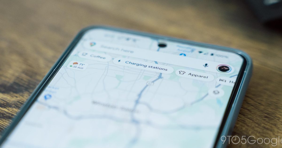
Over the course of 2024, Google Maps for Android has been working on a redesign that drops most fullscreen UIs in favor of sheets…
It’s amazing to me how much these companies spend on redesigns that add nothing but rounded corners one year, then sharp corners next year, and so on…
A friend of mine worked for a FAANG company and he taught me that people get promoted for creating something “new” rather than improving something that already exists.
Bullshit. You are just regurgitating the same tired crap that’s been repeated on the Internet for years.
As someone who’s worked for such companies since the mid-90’s, it’s common knowledge that run-and-maintain isn’t appreciated, only doing new things is.
Someone who keeps things from failing is much more at risk during layoffs than those who work only on new projects.
Gonna call me a liar now?
You got get that W, you don’t get a W for making shit work. You are a cost center haha
As someone who works for a similar company now, this notion and the success of this strategy/mindset greatly exaggerated.
Considering how often new projects get axed at Google you couldn’t possibly be safer on average than working on a golden goose (like Search/Android/Maps/etc).
You got me. I made up a story so I could get my one upvote.
It’s repeated because it’s true. This is very common in the industry.
I work at a FAANG adjacent company and it’s exactly the same thing here. I believe it 100%
It’s busy work to justify a lot of positions. Think how many people are needed even for a minor change like that in an organization as large and bloated as google
deleted by creator
MD sucks balls, I despise this crap. It makes a less obvious distinction between elements to look cool, or new or intriguing, or different, or whatever bullshit UI designers come up with.
UI everywhere has been going backwards for 10-15 years now. Giant ovals with text for the Quick Settings buttons is an improvement? More swipes is better? Less contrast in a browser/app window is better?
Oh yea, let’s remove color from status bar icons 🤦🏼♂️
deleted by creator
I literally can’t even tell the difference between the first set of pictures other than the new one looks like it has an added advertisement on the center panel.