fossilesque@mander.xyzM to Science Memes@mander.xyzEnglish · 2 years agoWhat pride flag is that?mander.xyzexternal-linkmessage-square6linkfedilinkarrow-up1351arrow-down15
arrow-up1346arrow-down1external-linkWhat pride flag is that?mander.xyzfossilesque@mander.xyzM to Science Memes@mander.xyzEnglish · 2 years agomessage-square6linkfedilink
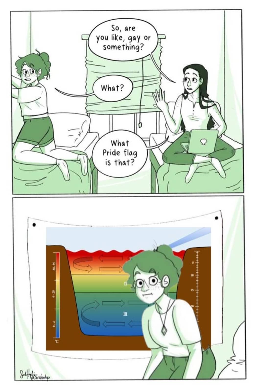
minus-square👍Maximum Derek👍linkfedilinkEnglisharrow-up17·2 years agoI don’t recognize is specifically, but it looks like a chart of relative temperatures and mixing currents between the ocean surface, themocline, and dead zone.


I don’t recognize is specifically, but it looks like a chart of relative temperatures and mixing currents between the ocean surface, themocline, and dead zone.