

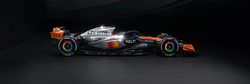
Big McLaren Vodafone energy
Definitely

I hate to be negative but… it’s almost an achievement in itself to produce something this comparatively boring with such strong base materials. Their colour scheme is so strong, going with mainly a semi-glossy silver is great and the orange insides of the air intakes make it look rad from the front but…
Why did they stop there? Why is the overall pattern just like a “default livery pattern from Motorsport Manager”? Why doesn’t it follow the lines of the car?
It’s not by any means horrible, it just feels like it could have been an all-timer and ended up being just okay. Still very happy to not have the Stake monstrosities on the grid anymore.
It’s like the livery went to marketing first and then along with some memo from upper management to a contracted designer that just followed the notes with zero creative input on the process.
Feels like they’re trying to be ‘modern’ by not going with the lines and being blocky instead.
😐
I like the orange on the inside of the side pods. I’m worried it won’t be as noticeable on the real car though
After sleeping on it, I wonder whether this livery is supposed to reference the Silver Arrows story? As in, it is supposed to look like the black and lavared livery has been scratched off most of the car with silver aluminium now being exposed?
Damn that looks fantastic. Big Vodafone energy
I like it but they ruined the surprise by showing the concept livery months ago.

