For me it was encapsulated by doom 3 for the most part. Games with strong dynamic shadows like splinter cell chaos theory and stalker with a mix of shiny specular effects is timeless for me. When I go back to these games the shadows still feel as good as they did when they came out and the lighting perfectly crafting the mood. A lot of modern games now even though their fidelity on paper is much better just always feel extremely flat to me and don’t pop out of the screen like they used to. It seems like they’re missing contrast and UE5 seems to make this even worse where all the games using it just look like mush
PC-98 is still unmatched. Nobody ever needed more than 16 colors.
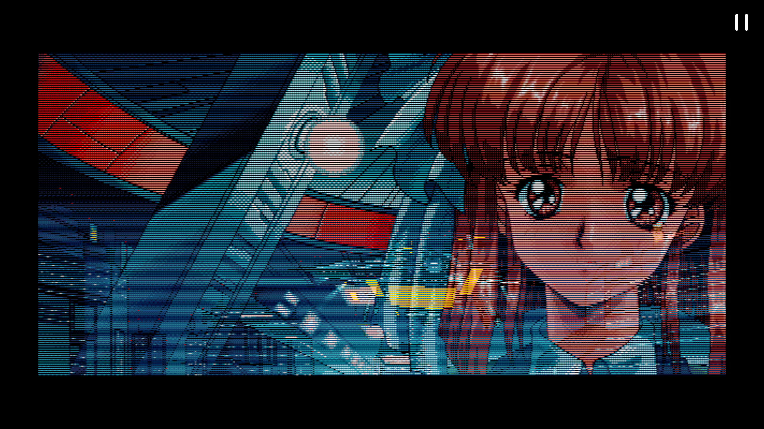
The dithering on this image is nuts
Shame so much of that computer’s library of games is locked behind Japanese, tragic.
I never had one, but I am partial to gamecube level graphics. A lot of features, but not to the point of realism, leading to very visually interesting stuff.
I agree. Luigi’s Mansion, Kirby’s Air Ride, Super Smash Melee all still look good to me
Can’t leave out Wind Waker especially. When Nint*ndo began promoting the game, a lot of capital G Gamers were malding about their decision to pursue a cartoonish art style rather than the more “realistic” style of other titles in the series (Majoras Mask before it, and Twilight Princess after). This was in stark contrast to titles like SSBM which were able to capitalize on low-complexity scenes, putting all the detail into character meshes and high resolution textures - to the point where you could see the golden seams on Mario’s denim overalls for the first time in the history of the franchise, and overall trends in the contemporary gaming industry (same year as the release of Halo: Combat Evolved, for instance).
To this day, the game’s artstyle is truly iconic, and though it wasn’t intended, the cel shading technique used in the game scales up very well, making it delightful to play in emulators to this day, while the reliance on texture resolution makes a lot of other “highly realistic” games from the era look disappointing on modern high-resolution displays.
the wind waker style hatred might be my first recorded instance of not even remotely understanding what the fuck the GAMERS were whinging about. i love the art of windwaker
Oh man the little side quests in that game, mostly in the main town I think, were such a pleasure to explore.
I dunno about favorite era overall but the transition from beautifully crafted pixel art sprites in fighting games to… this… will never not be a tragedy to me.
It sucks cuz 2D animations like that can’t be replicated by the indie scene, you need a whole art department with a ton of experience and with essentially the entire industry having transitioned over to 3D those skills no longer exist in sufficient quantities.
Not that there aren’t modern 2D games that look great there just aren’t any that look like this.
Technically, Skullgirls exists but yeah, it’s outta the reach of many indie game dev
its definitely possible, there are a decent handful of skilled and passionate pixel artists still out there. But yeah, its kinda like hand drawn animation where its just so intensive that almost no company wants to do it
I don’t think they can really compare to godlike sprite art like 3rd Strike et al, but I have come to appreciate the current trend of super vibrant & detailed 3d models in fighting games. The last two Guilty Gears, Dragon Ball FighterZ, GBVS, & Street Fighter 6 are some of the best since they don’t aim for any sort of photorealism and embrace style. I absolutely love all the squishing & stretching of models ArcSys does to make super animations come to life
Truly a lost artform.
I found a YouTube link in your comment. Here are links to the same video on alternative frontends that protect your privacy:
Sprites that look vaguely 3D:
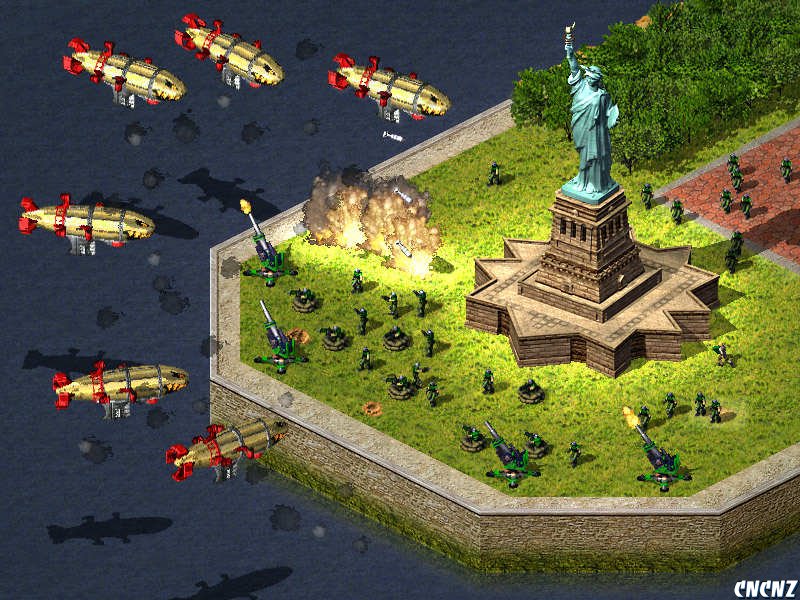
They make 3D models from which to generate the 2D sprites which is why they look uncannily 3D.
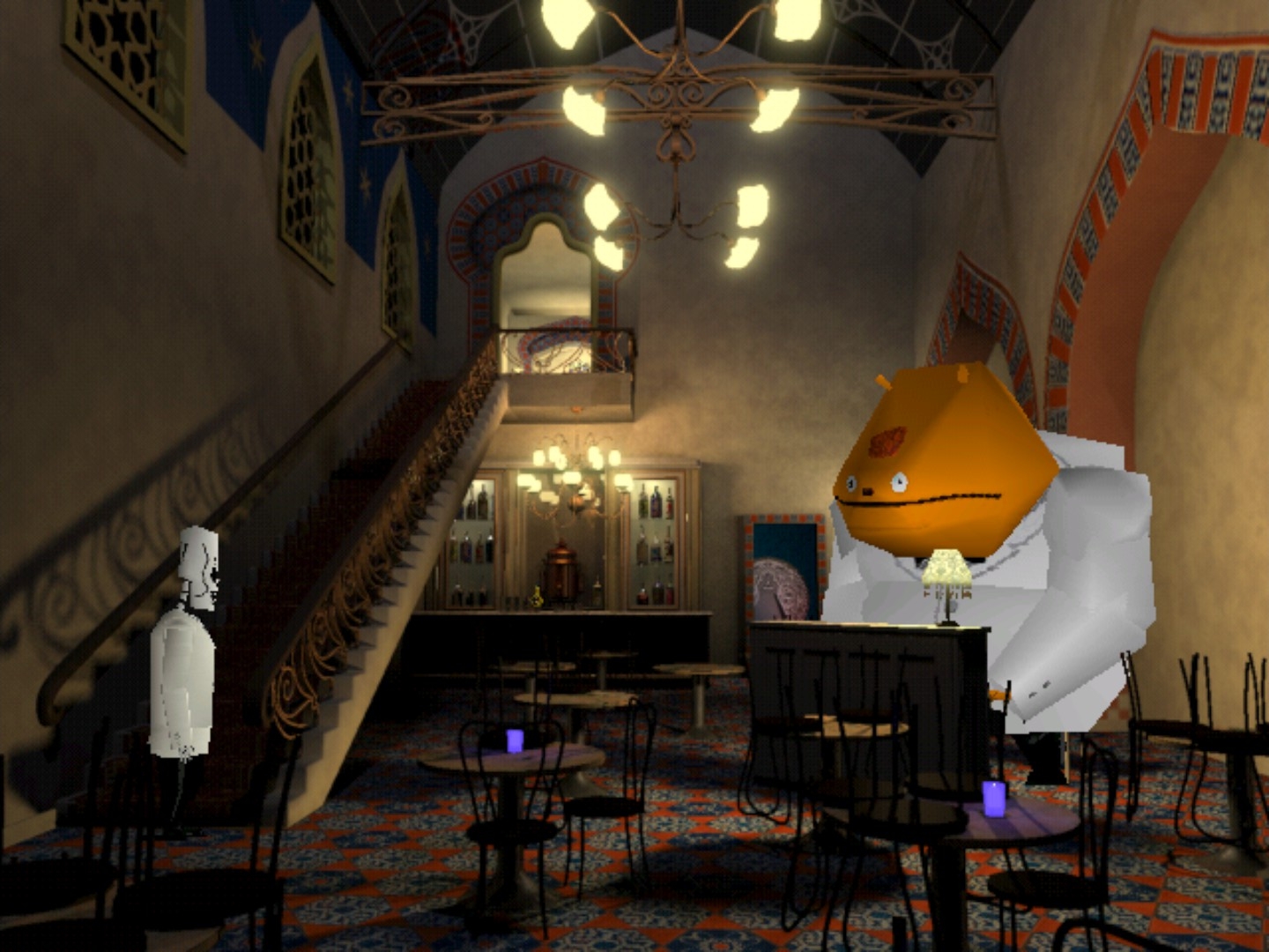
Art.
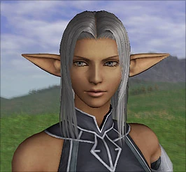
1999-2004-ish has a lot of nostalgia for me. PC games from around that time and consoles like the psx, ps2 and dreamcast I spent a lot of time with. We were starting to catch glimpses of what next gen visuals were going to look like on upcoming consoles like the 360 and PS3.
The difference between a PS1 game to a PS2 game was huge. I think the last real PS2 games that were released between 2006 - 2008 felt like they were really pushing the PS2 to it’s limits, except for the weird PSP and Wii games that were ported for the PS2, those had bad graphics.
Yeah it was really exciting seeing what developers were cooking up plus it was a time when art direction was huge and you had really talented people making these games look visually interesting.
Can’t forget about MGS when talking about pushing the PS2 to its limits. Both of those games look absolutely amazing. Both quite stylized while having some of the most realistic graphics of the console
Gran Turismo 4 and the Silent Hill games (except the PSP/Wii version) were also very good. I think there were a few other fighting games and RPGs with very good graphics. And speaking of PSP, Parasite Eve 3: The 3rd Birthday looked just like a PS3 game on PSP, which is impressive.
Playstation. I know the ps2 graphics were technically “better” but i loved those pre-rendered backgrounds and fixed camera angles.
Late Amiga 3D games. You could just tell the vision far exceeded the hardware’s capabilities, but that didn’t stop them from trying. Some really impressive technical tricks and code optimization in that era because you couldn’t just throw more hardware at the problem.
I feel like part of why modern graphics look flat is that they’re so visually busy that you can’t appreciate entire scenes and end up just focusing on whichever part of the screen the action is happening on. But maybe that’s just me
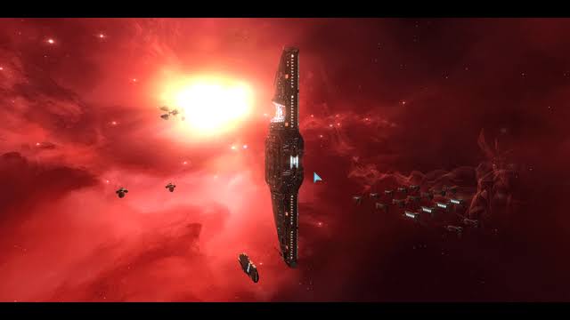
I remember the devs saying Homeworld had the graphics it did because they didn’t need to render terrain. They could then spend the polygon budget on the ships, punching well above its weight graphically. The original came out in 1999, the same year as Age of Empires II, C&C Tiberian Sun, and a year after StarCraft.
As an aside, the soundtrack is top five favorite ever. Sorry YouTube bot but I have to post the playlist.
I found a YouTube link in your comment. Here are links to the same video on alternative frontends that protect your privacy:
Fuck yeeaaah. Homeworld never ages its always beautiful
Older eve brings back so much nostalgia
Probably between 1995 and 2004/5. I really liked the mix of realistic and cartoonish styles we had during that period. Also, I think game genres weren’t completely established yet, so developers were much more creative and had more freedom to experiment with gameplay and graphics.
Late 2D art for me. While the early Playstation era has a lot of god-awful looking early 3D games, it’s also home to many of the best looking 2D games of all time. Some modern titles can get close to the level of quality those games had but even the best modern pixel art just isn’t the same as what the industry was capable of back then because there was an entire development pipeline for 2D art that doesn’t exist anymore.
now… because you can play games from all eras
I don’t care about graphical fidelity much and if anything I like ‘worse’ graphics because it usually means better performance. Chaos theory, Gta 4, and Kingdom come I think all look great. I still like how Halo 1, Kenshi, Grim dawn, and Bannerlord look though. I think art style and direction matter more.
if i had to point to a single game though it would be shrek 1 on the xbox.
I love Monkey Island for its pixel-ey goodness and hand-drawn point and click, the peak of which is probably Broken Sword 2, 1997.
These styles are still replicated by indie games now so they were clearly doing something right.
