What fonts are you currently using on your system? Which do you think is best for the terminal or for your desktop environment?
(updates) Ok I think I’m a fan of Ubuntu nerd fonts right now
Lato, League Spartan, League Gothic are my three most used fonts by a wide margin. Lato and its variety of weights for most things, League when I am doing design work and need a cleaner title or header.
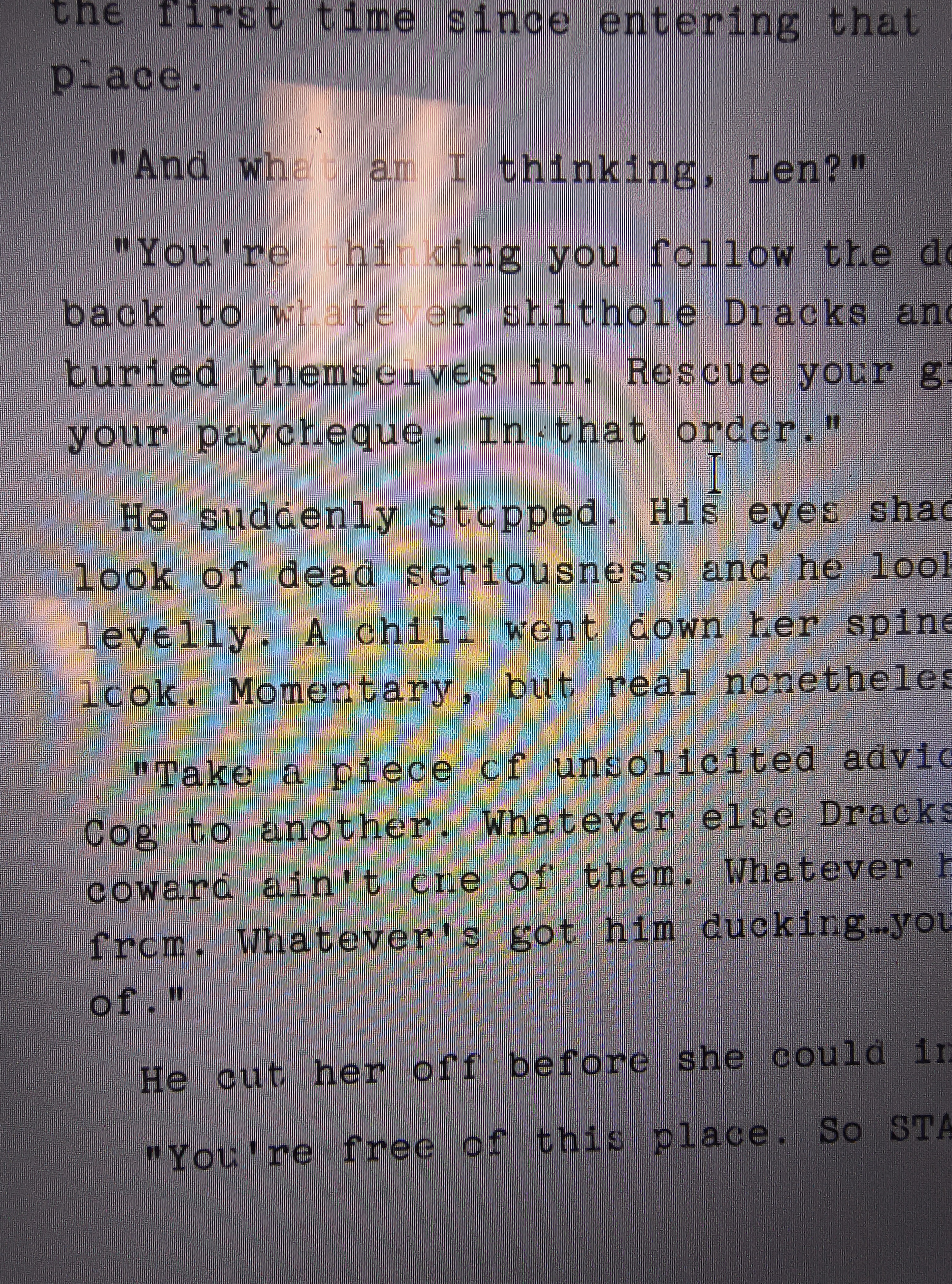
Lately ive been weirdly taken with TT2020 Style G, which is an odd name for a no-name font that replicates an old imperfect typewriter. For whatever reason, switching my writing software to that (Manuscript) suddenly fired up my writing flow.

I don’t have a reason to move away from the Fedora defaults except for monospaced fonts.
Terminal wise, terminus is my default. It’s so clean, and it looks good without anti-aliasing.
Roboto Mono is my current preference for monospaced fonts.
Adobe Source Code Pro and JetBrains Mono are good alternatives as well.
Ubuntu Mono for terminal, code, and data, Open Sans for the rest
Iosevka
Fantasque
Hack nerd font is my go to for terminal use.
I use M+ Fonts for most of my stuff.
I know that this will anger some people, but I just use the defaults and I don’t get why there are so many fonts, since they don’t seem that much different to me.
I’m design nerd and definitely appreciate the variety but you don’t gotta be. The defaults are generally pretty good (if not great) with any major OS these days.
Since basically forever I use DejaVu Sans for UI elements and DejaVu Mono for the terminal.
me too, I loved Verdana before I discovered FOSS and DejaVu Sans is basically FOSS Verdana
I always use Dejavu sans mono for terminal and programming too. I think its the best in terms of readability where indentation is important
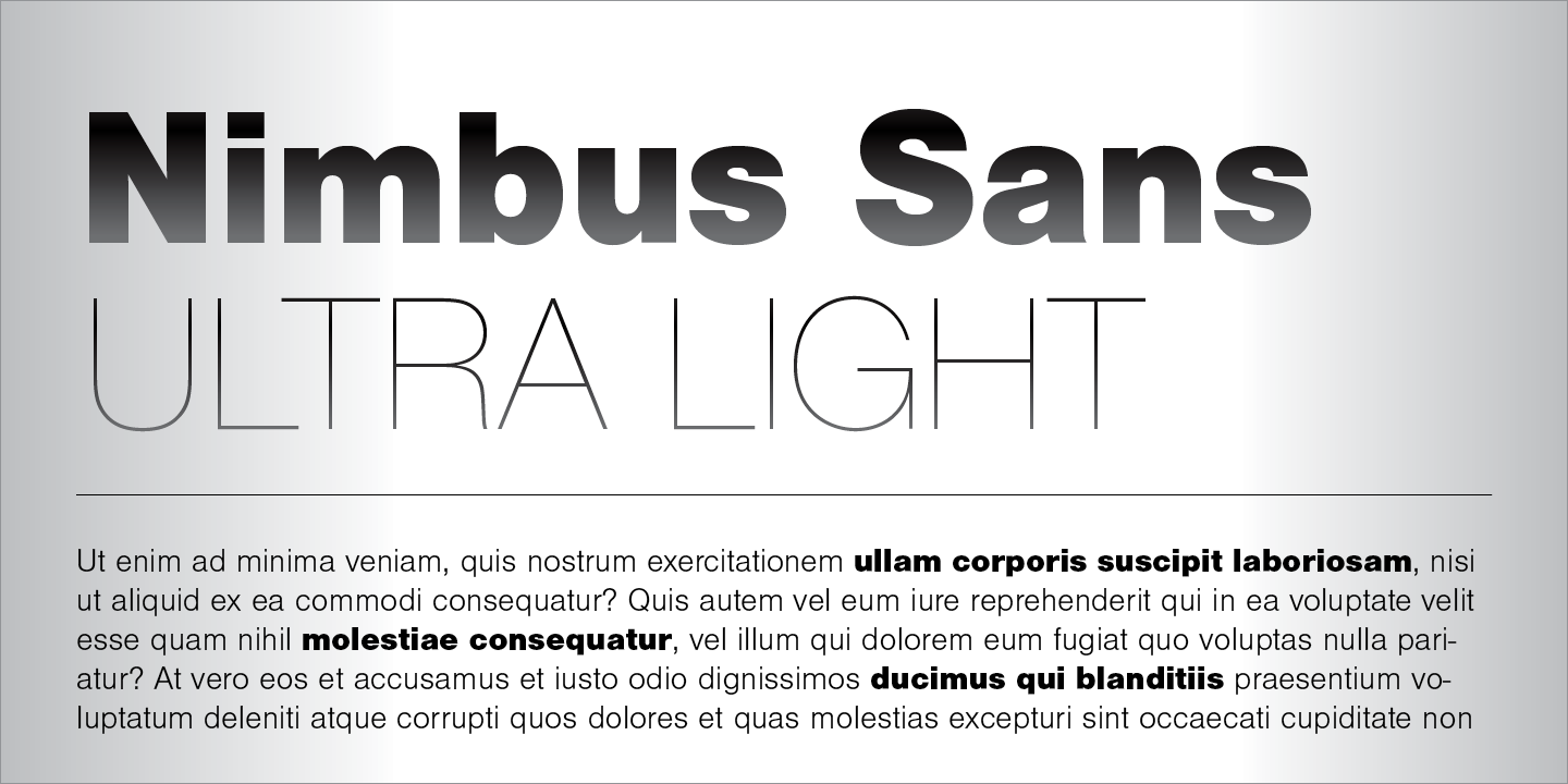
Anyone using Nimbus Sans?

It’s actually preinstalled in a lot of systems. You can check via
gnome-font-viewerorfind /usr/share/fonts -name "*Nimbus*"Ubuntu font. Idk why but I like it.
I agree! Nice memories of hitting backspace in a Linux Mint terminal and hearing that weird-ass BWOUP sound.
I recommend Ubuntu Mono for Termux users. Look at this black-background beauty – way better than the angly flat default

Iosevka.
Iosevka fits very well with East Asian characters, if you need those.
I find it narrower than I like otherwise, but I need Japanese characters often enough that I put up with it for my terminal.
Same. I’ve compiled a custom variant of Iosevka for terminal and code, because I want to have some chars in a certain way, especially the 0 and the & for even better readability. I used to have Monoid for code and terminal, but it the pixel perfect size for 12pt was getting too small for me and my eyes are not getting any better. Iosevka looks better even after some hinting by the OS.
On the rest of the desktop UI I use B612, because it is very ledgible, I recently switch over from the hyperledible Atkinson font. Before that I had Gidole on the desktop. Very pleasing, but not that readable at same font size.
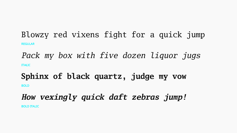
i want serifs. I use Go Mono for monospaced text. i’ve yet to find a good proportional slab serif font to match though.
By proportional slab serif do you mean unmonospacing the monospace like what Ubuntu does? I guess that’s why Go Proportional wouldn’t work being a sans serif
🟨 Preview: Go Mono

yeah just using the same characters but “squished” doesn’t work since the serifs take up the character space. you need a font designed as proportional. slab serif just means that the serifs are squared rather than pointed like on Times.
I’ve been a fan of IBM Plex for a while now.


