You must log in or register to comment.
The only emotion this elicits is confusion 😕
I find it pleasing
Sorry if this makes me sound like uncultured swine, but is this piece a reference to anything? Like did this artist want to do an homage to something else? Or is it just a bunch of random bullshit of varying shades of white placed into a concise pattern?
I also have a hard time believing this to be intentionally meaning bearing, mostly due to this being a pop art meme overused in both social media and marketing.
Compare it to the ad poster, it can be art, but most of the time it isn’t meant to. (and to my mind the ubiquity of ad posters raises the noise that the intentional art needs to cut through)
I believe OP is trying to troll the comm, or at least confused about the ambition of the comm.
But for shits and giggles I gave it a good 5 minutes of viewing and quite some generosity, two themes pop out: Contrast between old and new play, and a generational shift in Escapism
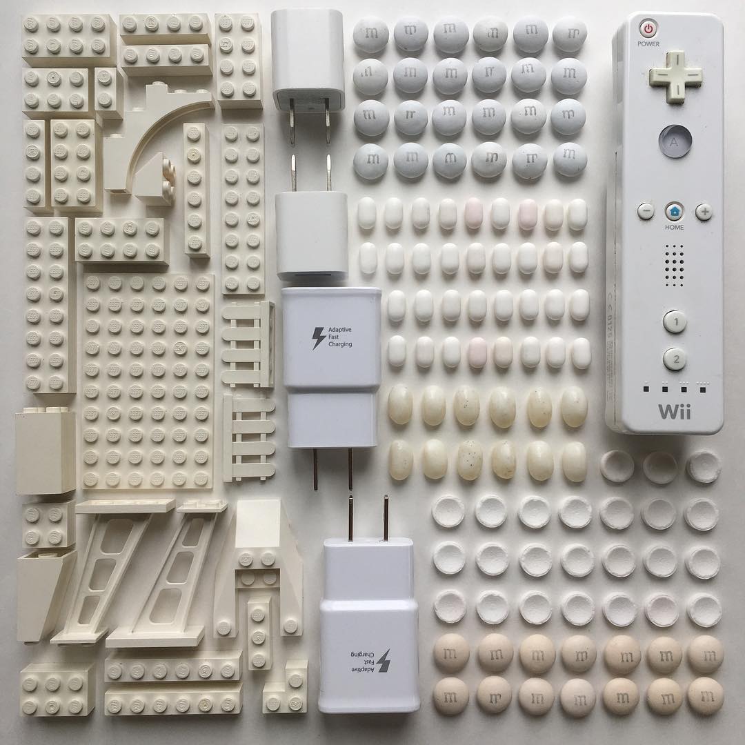
On the left side the legos are beige, interrupted by a line of chargers before the right side with candies, and the console controller.
This could try to convey a motif of a generational shift from constructive, wholesome play to an instant gratification paradigm. Maybe with the advent of the informational age
There’s a difference in compositional choices I don’t understand, and with the background of this art style am prone to dismiss as for visual effect rather than intentional meaning.
The shapes on the left side seem mostly to draw the eye rightward. The curve in the top left which could have signified a softening of regimentality is in contrast to the straight and formal positioning of non-rectangular pieces in the lower left. This could be trying to convey the variations or turmoil within the old paradigm, but this level of skill isn’t expected neither from art form nor artist, and as it’s a staple of the pop art style I’m leaning towards it being only for visual effect.
I find no way of differentiating the choice from just starting it as a social media post and half way thinking of a cool contrast.
Looking closer at the pills on the right side, none of them can be identified as pharmaceuticals, but several of them are famous candy shapes. I conclude that they most probably represent only candy and no pills/drugs.
Also on the right side, the controller breaks the motif and catches the eye, both for a visual payoff. But I see no reflection or contrast of controller against candy, nor divider, nor against lego.
If I stop looking for deeper meaning in the relations of elements and just look at emotional impact, it could simply be a nostalgic representation of early millennial childhood . Where the dividing line isn’t a divider, but it’s own part of a tableau, and the choice of items being significant as a collection rather than as elements.
I find no layers of meaning hidden in the contrast or relationships of elements, no artful nods that usually give away mastery enough to wield subtle meaning.
(and the more I look at it, the less I admire the craftsmanship)
Also on the right side, the controller breaks the motif and catches the eye, both for a visual payoff. But I see no reflection or contrast of controller against candy, nor divider, nor against lego.
Perhaps they are trying to draw a parallel between the shape of the candy and the shape of the buttons, saying that the controller is like candy. On the one side they have toys commonly considered to be educational and therefore healthy, on the other side they have things considered to be unhealthy. By putting the controller on the side with the candy, they are stating that it is also unhealthy.
However, aside from being a partition, I don’t see how the chargers relate. Perhaps they’re supposed to symbolize the rise in personal electronics, and in doing so, effectively compare personal electronics to candy as well? I mean, if the rise of personal electronics created a box, and candy and Wii remotes are in there, then that means it is also stating that personal electronics are unhealthy.
I mean op is a mod so I would hope they are not just trolling.
I wouldn’t expect them to, but it would be a hilarious trolling :P
Yeah I have a hard time finding any meaning in this one. White might represent the bleached existence that people want. There m & m s and drugs. A console controller. Maybe that represents the escapism people seek. Legos might be a person trying to piece together life but rather than piece it together they lay it out in rows because it’s expected of them? And I have no fucking clue about the power bricks. They paced to face each other so maybe opposition.
It’s all over the place though nothing really strikes a meaning or really does much to elicit a feeling. Good art has themes and makes you think. This just feels like bullshit, like someone was just throwing it together and hoping it was art or trying to submit something for a grade.
Looking at other stuff he’s done on instagram, he might just like putting things into color patterns that interest him. Living artists are interesting to follow because maybe they are making something meaningful, or maybe they were just messing with colors.
Some of his stuff is obvious referenced art made out of objects, as well, so I might just be oblivious too about this one.
Ya, this is the kind of art that just makes me mad.
I’m getting the sense that the artist took a photo or scene and tried to recreate the shapes with random white items they found. If you squint, you can just almost pretend it’s a building on the left hand side with the sky on the right, not sure about the wii controller.
I’m 98% sure it’s just white-colored things he had laying around. No deeper meaning.
I like trying to interpret it more than having a solid interpretation.My mind goes to a overhead view of a building and some open field area separated by a road, or maybe s Walmart esque place separated by the road from its parking lot. Or maybe you’re down town looking at the skyscrapers before you.I don’t know what they wanted to convey, but I like examining what I get out of it.
i’d upvote this if it weren’t posted under traditional art
I’m gonna use this one comment to react to everyone else here.
I don’t know if I should feel amused by the controversy this post has raked up, or feel happy finding out that the community is active after all (I was genuinely starting to believe we were dying out)
So I kind of feel both??
This artist is a self-proclaimed ‘object arranger’ so I think his works fall under ‘arrangement art.’ pretentious or not, I do believe in celebrating experimental forms of art rather than alienating them for not conforming to what is ‘traditionally’ accepted.
speaking of, to the people who feel confused by the name of the community, feel free to give the side-bar a little look-see for clarification. It’s the best I could do under the circumstances and I positively believe more are in favor of it than against it. (I certainly think it’s better than vague but misleading alternatives like “ArtPorn” or any kind of “Thing-Porn” for non-pornographic stuff, which is terminology that’s somehow commonly accepted by people who grew up with reddit)
As far as my personal interpretation goes: I find myself reacting to the work the way I’d react to a sandcastle made by a little child, or ancient cave paintings or sculptures (like waaaay back, thousands and thousands of years ago where finding an odd shaped rock made you the coolest caveman in the tribe, for a month)
I think the only thought It has provoked in me thus far is: when does a pile of things cease being a pile of things and turn into a reflection of the time and place where it’s from? would people react the same way if they saw an unexplored cave with specific arrangements of rock?
But yeah that’s about all the attachment I have to this particular post. His works are in a folder among other folders which I shall empty 5-6 files a day so no, i will not stop posting this person’s work until I’ve emptied out all the folders. feel free to upvote/downvote accordingly
And yes, to the extent that no-one other than me posts to this community, all the posts in here will be heavily flavored by the preferences of the ones posting. Don’t like what you see? stop being grumpy about it and POST THINGS which you do like!
If this is shallow, show me what you think is DEEP!
peace
I’m sorry, but I can’t let this stand. It’s “look-see”, not “looksy”. Get it? Look? See? First you look, then you see.
Ah, I mixed up ‘looky’ and ‘look-see’
Ah, that makes a lot more sense. I think a lot of this trouble would be avoided had you named the sub “physical art” instead. Maybe you could change the display name to “physical art” or “traditional/physical art”?
It’s cool, but I think using this sub as an umbrella for everything non-digital is a bad idea. It should either be renamed to physical art, or another community should be made for contemporary art.
Is this loss?
Is it though? I’m so confused
I see || and |_
But I can’t figure out how to make the legos look like |
The placement is so precise and soothing.
Except for the bottom middle M&M, which is slightly off.
Not traditional art, but strangely evocative.
Artist’s Instagram: https://www.instagram.com/witenry/
I feel like this photograph is what captain Holt would have in his office (RIP Andre).
It kinda looks like a model city being viewed from above.
I like those Lego space slope pieces, they’ve got a nice motion to them.
I like it. Modern design language is towards muted colours and heavily features grey so the juxtaposition of something made for kids, with colour prevelent, now muted like the chargers does something in my head. With the wiimote we even have the intersection where play met sleek, modern design which is much less playful.
Am I reading into it too much? Ye, but I like it. Seperate to this I do, seperatly, enjoy muted colours and sleek design language common to the mid to late 2010s up to now so I assume that’s part of my enjoyment
This deserves way more downvotes


