- cross-posted to:
- programmerhumor@lemmy.ml
- programming_horror@programming.dev
- cross-posted to:
- programmerhumor@lemmy.ml
- programming_horror@programming.dev
I am not allowed to credit the site that has this disaster. Its owner said “Nobody should see that”
The author should be killed for indentation alone.
I know, right? Needs more tab.
We are witnessing a hate crime.
Client: “Can you switch these two colours, you have 1 minute to fix it or you’re fired!”
Result:
my eyes
color: lime !important; z-index: 1000000;I love the superstitious z-index just in case it does something to help.
At least that’s actually easy and quick to do and is the only way of doing it. Centering a div however has 81639393 ways and it seems the one that works is different every time
Bro its so easy bro, just use flexboxgridcolumns its been a standard since 2010 just flex it bro you haven’t learned to flex yet just check w3c schools and add a flex you can polyfill it but don’t use that hacked one use the good flexpolyfill then { content-align-middle-child-elements: center-middle-true-neutral } so easy with flex bro
I know you meant this sarcastically, but yes, flex is a good option for centering something. Either that or setting the left and right margins of the element to auto, which is generally even easier.
Basically, if you’re in a flex container use flex, if you’re in a grid use grid, and if neither of those apply set the left and right margins to auto.
Also seriously, anybody having problems with flexbox should try this:
I’m not sure there’s any version of it for grids, but IMO grids are inherently more intuitive, so it may not be needed. Flexbox is the one that is hard to learn.
Well, flexbox and grid have different purposes in my opinion/experience. Personally I use grid for “top level” layouts like the layout of the whole site, while I tend to prefer flexbox for layouts inside the grid. Of course that’s just a rule of thumb, there are absolutely cases where this isn’t the best option.
I don’t know any CSS (despite reading memes about it like this) but I do know that the bottom of that page has a link to something called Grid Garden
Also exists as Tower Defense
You’ve perfectly captured twitter tech bro energy it’s kind of incredible actually
Dude, stop flexing on him. You’re gonna make him cry.
It’s 2024 and flexboxes still don’t work that well with vertical direction and wraparound…
Do you have an example?
Sure. Here you go. The green container should cover all red boxes in both cases. I’ve been bashing my head against this issue for a while, but, as far as I understand, this is a bug that’s never going to be fixed. Which sucks, because I wanted to re-design some of the apps in the horizontal metro-style scrolling manner for the bottom screen on my zephyrus duo, but this effectively prevents me from doing so (Unless I use grids and set positions manually).
That’s interesting. Chrome displays it as you intended, Firefox doesn’t. I guess it’s required that the vertical flex be
inline-flex?
It’s a good indicator that someone is desperate and/or doesn’t know what they’re doing.
Not allowed to credit the site in your text editor?
Is the owner in the room with you now?
This screenshot is not mine, it was sent to me via Matrix
You get used to it. I don’t even see the code
Do you have a built-in browser in your brain that renders it?
All I see is blonde, brunette, redhead. Hey uh, you want a drink?
Free drink? Absolutely
It’s good for two things: De-greasing engines and killing brain cells.
…it was sent to me via Matrix
That’s how they do pull requests there
Well, that’s what you get for using classes like “white” and “lime”.
Exactly this. Bootstrap killed the css star.
People learning CSS through shitty frameworks:
At first I only noticed the indent. Wtf
I’m appalled that classes representing visual styles are still a thing. I thought everyone already figured that it was a bad idea back in bootstrap days. But then I recently had an opportunity to work on project that uses Vuetify and saw quite long poems about flexboxes in class names…
And then came Tailwind…
I know! What a mistake of a framework. Glad my colleagues drummed it out of me.
I gave it a chance for a tiny project but even then it was painful.
Aren’t classes in CSS supposed to represent visual styles? What else could they be for?
Pretty sure they’re referring to class names describing the visual style being applied, rather than what that class represents semantically.
E.g.
.red-boldvs..error-textOh, that makes sense.
Well, there’s not exactly a
classtraining you have to take before writing CSS, so everyone starting out with it gets to make all those same mistakes for themselves before they know how to use classes sensibly. I myself am some backend guy, who has to write CSS far too often.It certainly also does not help that various CSS frameworks out there do exactly that…
It certainly also does not help that various CSS frameworks out there do exactly that…
Bootstrap (as of v5) being one of them.
div class="d-flex gap-2 my-3 align-items-center flex-nowrap justify-content-betweenI was annoyed at this at first, but I’ve since noticed that I write hardly any CSS any more, because most rules really are “just add some space, vertically align, be red”.
Yeah, the reason why people deride it, is because it’s practically equivalent to:
div style="flex: 1; gap: 2em; margin-top: 3em; margin-bottom: 3em; ..."I had to look up what these do, so they might not be precisely correct translations, but hopefully, you get the idea. It’s mostly like using inline styles, and like not using classes.
In some scenarios, these frameworks might simplify certain things, like how
myapplies two CSS rules. And they reduce the visual clutter of inline styling somewhat.But overall, it feels like people are dissatisfied with semantic classes, but don’t want to lead the discussion for using inline styles, so they grab these CSS frameworks to pretend that they’re not using inline styles.
It is fundamentally a difficult discussion to lead, because inline styles feel great, while you’re writing them. They’re less great for maintenance.
But semantic classes definitely have long-term problems, too.Could argue here that you’re still writing CSS, just cross compiling to it from Bootstrap shortcuts.
“Figured it was a bad idea” actually means that some people were against it because they believed semantic class names were the solution, I was one of them. This was purely ideological, it wasn’t based on practical experience because everyone knew maintaining CSS was a bitch. Heck, starting a new project with the semantic CSS approach was a bitch because if you didn’t spend 2 months planning ahead you’d end up with soup that was turning sour before it ever left the stove.
Bootstrap and the likes were born out of the issues the semantic approach had, and their success and numbers are a testimony to how real the issue was, and I say this as someone who never used and despised bootstrap. Maintaining semantic CSS was hard, starting was hard, the only thing that approach had going for it was this idea that you were using CSS the way it was meant to be used, it had nothing to do with the practicality. Sure, your html becomes prettier to look at, but what good is that when your clean html is just hiding the monstrosity of your CSS file? Your clean html was supposed to be beneficial to the developer experience, but it never succeeded in doing that.
There’s nothing hard about semantic naming. Especially when you’re separating your elements into components and use SCSS or some other pre-processor.
Either you understand that the consensus is that naming things is hard and you just want to elevate yourself above everyone else by arguing against it, or you’re unaware that it is the consensus, in which case your opinion doesn’t really matter because you most likely underestimate the issue.
It’s such a truism that I’d suggest googling "naming things is hard*.
There are only two hard things in Computer Science: cache invalidation and naming things. – Phil Karlton
“Some coders just want to watch the word
burnget colored white and/or lime.”And if you delete one or the other, or condense the code into a single command, the whole site breaks.
Worse.

Isn’t cascading styles the whole point of Cascading Style Sheets?
You absolute fool. You must never utter its full name, lest you summon its wrath!
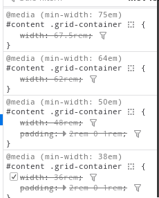
I don’t get it, isn’t this a pretty normal way of using media queries. Granted you’re more likely to see the widths defined in px.
Shhh… The poster doesn’t understand CSS and we shouldn’t embarrass them in a community with memes
My imposter syndrome kicked in full swing. I was ready to learn a CSS best practice and feel uncomfortable about it for the rest off the day.
Nowadays we do responsive webdesign instead of micromanaging widths.
This is technically responsive, but I think you have a fair criticism. A single rule like this would be much more maintainable:
#content .grid-container {
	width: 90vw;
	min-width: 12rem;
	max-width: 75rem;
	padding: 2rem 0 1rem;
}
Obviously, media rules have their place, but not for something that’s consistantly a full width container like this seems to be.
I am very, very surprised about the competence of the commenters here. I have had many discussions on reddit about the advantages of meaningful instead of presentational class-naming and you’re normally met with great resistance, especially with users of frameworks like Bootstrap and Tailwind.
Here, everyone seems to either ‘get it’ or is willing to hear why classes like .lime are bad. Very cool.
People that advocate for presentation naming haven’t endured a major company rebrand.
This guy has PTSD from working at “X”.
Frameworks like bootstrap are a cancer.
good for quick and dirty small projects tho…
It is like fentanyl don’t do it
It is like femtanyl
don’tdo it
Ikr, like I don’t need a full feature full stack framework… I just want my tech demo to not look like it was made in the 80s without spending hours. (I’m mostly a backend dev)
No.
It’s not too surprising. Consider the sort of person who would have abandoned reddit for Lemmy during the APIcolypse last year.
the userstyle experience:
Yeah, userstyles are wild. You learn so many ways how to not use CSS. Everything is
!importantand rather than adjusting the HTML to change the structure, you get to do it all in CSS. 🫠flex-direction:row-reverse;my beloved
No! I wanted orange!
I hate all webdev beyond using raw HTML, CSS and Javascript to make your own crappy website
no css! js is ok though. though it should be the focus of the page, as in, “observe this cool thing contained within this webpage: a calculator!”


